Introduction to the predictSource package
John Karon & Ben Marwick
2023-07-14
Introduction.RmdINTRODUCTION
A common problem in archaeology is estimating or predicting the source of the material used to form an artifact. Archaeologists may use 2- or 3-dimensional scatterplots of artifact chemical composition data to predict the source of an artifact. This package contains a suite of R functions to apply multivariate statistical methods to this problem, as well as functions to create analysis data sets, carry out some basic data quality checks, and perform some descriptive statistical analyses. Results are returned as tables or plots. The user can interact with some plots to identify data observations yielding points suggesting the need for closer identification; the code creates and returns a data frame containing the data of interest.
The package implements three multivariate statistical procedures: principal components analysis (yielding 2-dimensional plots), recursive partitioning (classification trees), and random forests. It may be of interest that classification trees and random forests can use both quantitative (e.g. chemical composition) and qualitative (e.g. a physical characteristic) data in the same analysis.
After creating analysis files and carrying out standard data quality and descriptive analyses, our suggested analysis strategy is the following. First, do a principal components analysis on the quantitative source data to evaluate whether the first two principal components account for a sufficient proportion of the variance among source samples, and to evaluate the separation among sources. Second, if it appears that the sources can be separated, use the source data in a random forest analysis of the source data to predict the source of each artifact. This analysis also orders the characteristics (which can include qualitative as well as quantitative characteristics) according to their importance in distinguishing among sources. Third use the quantitative characteristics to identify artifacts for which the predicted sources are not plausible in two ways: create side-by-side box plots of the distributions of elements in sources and the artifacts predicted to be from those sources (see Figure 4.2 for an example), and plot the artifact points on a 2-dimensional principal components plot, with symbols identifying their predicted sources, with the convex hulls of the source points. This step is essential for identifying missing sources, as the random forest analysis will assign every sample (artifact) to a source, even if the characteristics for a sample resembles those for no source. Fourth, use a classification tree analysis to identify the characteristics that are best suited to separating the sources The second last section of this vignette contains a discussion of using this procedure; the ordering of the predictors from the random forest analysis and the weights for the first two principal components may be very useful in specifying the classification tree model. We note that relatively large incorrect artifact source assignment probabilities from the random forest procedure may identify artifacts that need additional evaluation of their predicted sources (see Section 8).
The data used to illustrate these procedures are five elements from five obsidian sources in the Jemez caldera in central New Mexico (the sources are coded A through E) and obsidian artifacts from a valley east of that caldera (see the next section). The classification tree for separating the Jemez obsidian sources is in Figure 1.1. Of the five candidate elements, only strontium, rubidium, and yttrium are needed to perfectly predict a source (the two elements not used are niobium and zirconium). A principal component plot for predicting the source of artifacts using this classification tree (rather than from the random forest analysis) is in Figure 1.2. It shows that some artifacts predicted to be from source C are likely in fact from source B. We will see that the corresponding plot of the random forest predictions identifies no likely misclassifications.
library(predictSource)
data(ObsidianSources)
analyticVars <- c("Rb", "Sr", "Y", "Zr", "Nb")
tree <-
  ps_tree(
    data = ObsidianSources,
    GroupVar = "Code",
    Groups = "All",
    AnalyticVars = analyticVars,
    Model = "Sr"+"Nb"+"Rb"+"Y"+"Zr",
    ModelTitle = "Sr + Nb + Rb + Y + Zr",
    plotCp = FALSE
  )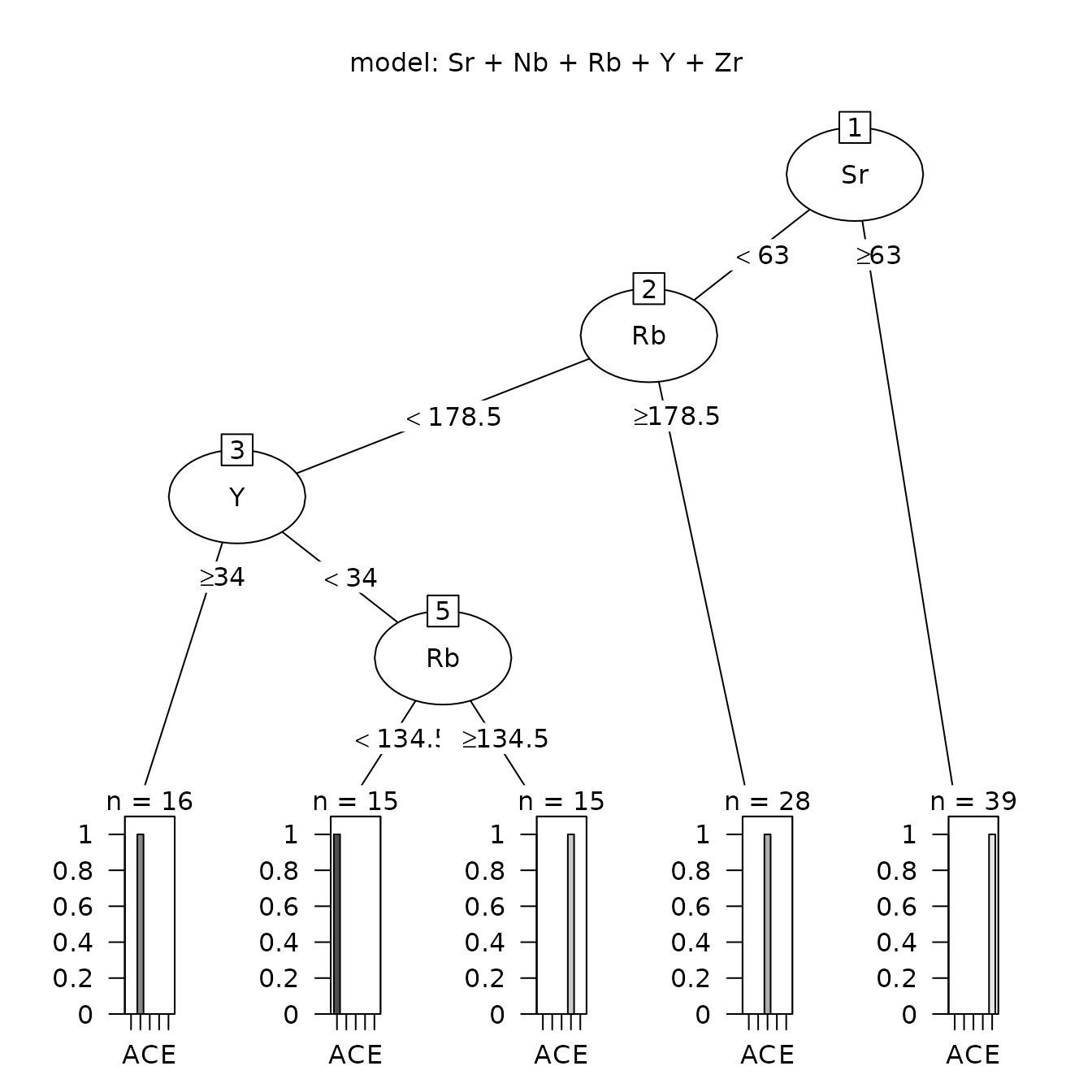
Figure 1.1: Classification tree analysis for the Jemez obsidian sources.
data(ObsidianSources)
data(ObsidianArtifacts)
analyticVars <- c("Rb", "Sr", "Y", "Zr", "Nb")
sources <- unique(ObsidianSources[, "Code"])
save.tree <-
  ps_tree(
    data = ObsidianSources,
    GroupVar = "Code",
    Groups = "All",
    AnalyticVars = analyticVars,
    Model = "Sr"+"Nb"+"Rb"+"Y"+"Zr",
    ModelTitle = "Sr + Nb + Rb + Y + Zr",
    predictSources = FALSE,
    predictUnknowns = TRUE,
    unknownData = ObsidianArtifacts,
    unknownID = "ID",
    plotTree = FALSE,
    plotCp = FALSE
  )
pca.eval <-
  ps_pcaEvaluation(
    SourceData = ObsidianSources,
    unknownData = save.tree$predictedSourceUnknowns,
    SourceGroup = "Code",
    unknownGroup = "predicted",
    known_sources = sources,
    predicted_sources = sources,
    AnalyticVars = analyticVars,
    plotAllPoints = TRUE,
    plotHullsOutsidePoints = TRUE,
    plotOutsidePoints = TRUE
  )
Figure 1.2 Principal components plot the sources of Jemez obsidian artifacts predicted from a classification tree with points outside the convex hull of the source samples.
The final two sections of this vignette contain a discussion of results using these methods and then information on using the functions in this package, including arguments that are standard among the functions, names of components of the list returned by each function, and instructions for selecting points of interest in some of the plots. We also provide information on the differences between interacting with plots in base R versus Rstudio. In particular, it will be necessary for a user running this code in base R (not Rstudio) to edit a function that produces multiple plots in order to view all of those plots. For those using Rstudio, we provide simple instructions for running the example code for a function.
EXAMPLE DATA
The example data available with this package are data on obsidian from five sources in the Jemez caldera in northern New Mexico and on obsidian artifacts from sites in the Pojoaque Valley east of that caldera. For both the source and artifact samples, our example analyses use five elements (rubidium, Rb; strontium, Sr; yttrium, Y; niobium, Nb; and zirconium, Zr; numerical values are in parts per million) analyzed by Steven Shackley using x-ray fluorescence. These are the elements that Shackley uses to distinguish among sources and predict the source of an artifact. The source data are publicly available (http://www.swxrflab.net/jemez.htm). This site also contains discussions of the geology of the source sites.
We selected data on 91 artifacts from approximately 450 artifacts collected under the supervision of James Moore, Office of Archaeological Studies, New Mexico state government. Shackley predicted the sources of these artifacts using two- and three-dimensional scatterplots; all except two were from the Jemez caldera (we omitted those two from consideration). These artifact data have not been published.
The artifacts were analyzed in Shackley’s lab in Albuquerque, New Mexico, using different instrumentation than that used for the sources. For a discussion, see http://www.swxrflab.net/labfees.htm#QuanX%20Energy-Dispersive%20X-Ray%20Fluorescence%20Spectrometer%20(EDXRF). For a more general discussion of Shackley’s procedures, see http://www.swxrflab.net/swobsrcs.htm.
The five obsidian sources are coded as A, B, C, D, and E in the source and artifact data sets (ObsidianSources and ObsidianArtifacts, respectively). The source or Shackley’s predicted source is in the character-valued variable Code. Each data set contains the variables Code, the five elements (as numeric variables, with variable names the element symbols), and a character-valued variable ID containing an artificial lab ID. For example, the first few rows of ObsidianSources are in Table 2.1.
library(predictSource)
library(magrittr)
library(kableExtra)
data(ObsidianSources)
knitr::kable(ObsidianSources[1:6,],
             caption = "Table 2.1: Sample of the data in the file ObsidianSources.") %>%
  kable_styling(full_width = F,
position = "center")| Code | ID | Rb | Sr | Y | Zr | Nb |
|---|---|---|---|---|---|---|
| A | A1 | 121 | 40 | 23 | 110 | 55 |
| A | A2 | 117 | 43 | 21 | 110 | 53 |
| A | A3 | 121 | 44 | 24 | 114 | 49 |
| A | A4 | 116 | 41 | 22 | 112 | 52 |
| A | A5 | 118 | 43 | 21 | 111 | 55 |
| A | A6 | 123 | 44 | 25 | 113 | 53 |
#ANALYSIS FILE CREATION AND CHECK
The following procedure produces an analysis file from excel data files, with the first row of each file containing the name of the variable represented by the data in that column. All files must have the same name for an element; if some files use “Zr” and others use “Zr “, the latter becomes “Zr.” when an R object is created. Also, variable names in R are case-sensitive, so “Zr” and “ZR” are different variables. In addition, each value of an element analysis must be numeric; the value “< 0” is not allowed. Missing values should be left blank.
To create an R object (a data frame) from an excel file stored in .csv format, use the R command
object_name <- read.csv(file = 'file name')Other R functions could also be used, including
read.table(); see the documentation for
read.csv (obtained by entering ?read.csv at
the R prompt) for alternatives and details.
If it is necessary to combine several data files into an analysis
file, use the function ps_createData() to create an R data
frame from each of the individual R objects. For example, Shackley’s
website contains an excel file with data for individual sources. After
creating an R data frame for a source using
e.g. read.csv(), the element dataOut of the list created by
ps_createData() is a data frame with the analysis variables
in a specified sequence; to create this new data frame, use the
command
new_object_name <- ps_createData(data=object_name)$dataOutwhere object_name is the data frame created from
read.csv(); alternatively, save the result of
ps_createData() as an R object (a list), and create the new
data frame with the command
new_object_name <-list_name$dataOutThese data frames can then be combined into an analysis data frame
using the R function rbind(). If it may be necessary to
repeat this operation for a number of source files, it may be useful to
define an R function
ps_combine <- function()
rbind(data1, data2, ...)
This function will return the result of the rbind()
operation to define a data frame, such as
analysisFile <- ps_combine()After creating the analysis file, use
ps_checkData(data=analysisFile, CheckDupVars, GroupVar, Groups, AnalyticVars)to obtain basic descriptive statistics and carry out several data checks (number of observations, number of missing values, number of negative values, duplicate observations, and descriptive statistics, by group and analysis variable). For the data set ObsidianSources, there are no negative values for the five elements of interest and no duplicate observations. The numbers of observations by source and element are in Table 3.1. Note that the R object returned by this function contains rows with NA (the R code for a missing value) between rows of descriptive statistics for each group; those rows could be replace by rows of blanks in an excel file.
| Group | Rb | Sr | Y | Zr | Nb |
|---|---|---|---|---|---|
| A | 15 | 15 | 15 | 15 | 15 |
| B | 16 | 16 | 16 | 16 | 16 |
| C | 28 | 28 | 28 | 28 | 28 |
| D | 15 | 15 | 15 | 15 | 15 |
| E | 39 | 39 | 39 | 39 | 39 |
| Total | 113 | 113 | 113 | 113 | 113 |
The descriptive statistics for the elements in the classification tree in Figure 1.1 are in Table 3.2.
library(predictSource)
data(ObsidianSources)
checkData <-
  ps_checkData(
    data = ObsidianSources,
    CheckDupVars = c("Code", "ID"),
    GroupVar = "Code",
    Groups = "All",
    AnalyticVars = c("Sr", "Rb", "Y")
  )
knitr::kable(checkData$statistics, caption = "Table 3.2: Descriptive statistics for the elements in the Jemez obsidian sources used in the classification tree in Figure 1.1.") %>%
kable_styling(full_width = F, position = "center")| Analysis | Group | min | Q1 | median | mean | Q3 | max | n_missing |
|---|---|---|---|---|---|---|---|---|
| Sr | A | 36 | 40 | 42 | 42 | 44 | 54 | 0 |
| Sr | B | 9 | 10 | 10 | 10 | 10 | 11 | 0 |
| Sr | C | 0 | 5 | 6 | 5 | 7 | 8 | 0 |
| Sr | D | 2 | 10 | 10 | 9 | 10 | 11 | 0 |
| Sr | E | 72 | 85 | 86 | 86 | 89 | 95 | 0 |
| NA | NA | NA | NA | NA | NA | 0 | ||
| Rb | A | 106 | 114 | 116 | 116 | 120 | 123 | 0 |
| Rb | B | 156 | 158 | 159 | 162 | 164 | 178 | 0 |
| Rb | C | 179 | 202 | 205 | 206 | 214 | 222 | 0 |
| Rb | D | 146 | 148 | 150 | 152 | 156 | 165 | 0 |
| Rb | E | 87 | 99 | 101 | 101 | 104 | 111 | 0 |
| NA | NA | NA | NA | NA | NA | 0 | ||
| Y | A | 18 | 20 | 21 | 22 | 23 | 27 | 0 |
| Y | B | 41 | 43 | 44 | 44 | 44 | 47 | 0 |
| Y | C | 58 | 62 | 63 | 63 | 65 | 69 | 0 |
| Y | D | 21 | 23 | 23 | 23 | 24 | 25 | 0 |
| Y | E | 20 | 22 | 24 | 24 | 26 | 28 | 0 |
| NA | NA | NA | NA | NA | NA | 0 |
The example table shows that, in the descriptive statistics data frame (Robject$statistics), there is a row for each element and each source, with a row containing missing values (NAs) between elements. If this data frame is written to an excel file, those rows between elements can be converted to blank rows, to make the resulting table easier to read. Note that the second split in Figure 1.1 is on Rb, even though there is only a one unit difference between source B (maximum 178) and source C (minimum 179). This will lead to misclassification of artifacts.
For understanding later results, we need the corresponding descriptive statistics for the artifacts.
library(predictSource)
data(ObsidianArtifacts)
checkData <-
  ps_checkData(
    data = ObsidianArtifacts,
    CheckDupVars = c("Code", "ID"),
    GroupVar = "Code",
    ByGroup = FALSE,
    AnalyticVars = c("Sr", "Rb", "Y")
  )
knitr::kable(checkData$statistics, caption = "Table 3.3: Descriptive statistics for the elements in the obsidian artifacts used in the classification tree in Figure 1.1.") %>%
kable_styling(full_width = F, position = "center")| Analysis | min | Q1 | median | mean | Q3 | max | n_missing |
|---|---|---|---|---|---|---|---|
| Sr | 8 | 10 | 12 | 12 | 14 | 44 | 0 |
| Rb | 113 | 158 | 177 | 181 | 206 | 242 | 0 |
| Y | 19 | 25 | 45 | 44 | 62 | 69 | 0 |
Note that, comparing the two tables, by comparing the distributions of strontium in the sources and the artifacts, we see immediately that none of the samples from source are from source E.
EXPLORATORY ANALYSES
The package contains functions to create basic descriptive statistics tables and plots: box plots, pairs plots (a matrix of two-dimensional scatterplots), and coefficients of variation and correlations between pairs of elements.
Box plots
Box plots, created by the function ps_boxPlots(), are
useful for comparing the distributions of an element among sources and
for identifying outlying values. Figure 4.1 shows box plots for four
elements for the source data. To understand the information in a plot,
look at the plot of zirconium at source C. The heavy line, at the narrow
part of the notch, is the median of the zirconium values at C. The top
and bottom of the box represent the 25th and 75th percentiles of the
data, respectively (the quantiles). The notches define a 95% confidence
interval for the median; if these do not overlap for two sources, it is
plausible that those sources have significantly different medians.
(These plots yield warning messages that some of the notches should
extend beyond the quartiles; these messages can be ignored.) Vertical
dashed lines from the quartiles to a larger or smaller value with a
horizontal line define the ranges of “adjacent values”. The largest
adjacent value is the largest value less than or equal to the upper
quartile plus 1.5 times the interquartile range (the upper quartile
minus the lower quartile). The smallest adjacent value is the smallest
value greater than or equal to the lower quartile minus 1.5 times the
interquartile range. For a standard normal distribution (mean 0,
standard deviation 1), the median is 0, the upper and lower quartiles
are 0.68 and -0.68, respectively; the upper and lower adjacent values
are 2.72 (4 x 0.68) and -2.72, respectively. The probability that a
value from standard Gaussian distribution is greater than 2.72 is 0.003.
It follows that, for Gaussian data, the probability that a value lies
outside the range of adjacent values is less than 0.01. Therefore,
values outside the range of adjacent values either may be considered
outliers, or the data is unlikely to be Gaussian.
If the box and the adjacent values are approximately symmetric around
the median, then the distribution of the data is approximately
symmetric. Relative variation for values for an element among sources
can be evaluated by comparing heights of boxes among sources.
the boxes
From Figure 4.1, below, we see immediately that there is little variation among the values of an element at a source. There are a few outliers, but they are not far from the range of adjacent values.
library(predictSource)
data(ObsidianSources)
analyticVars <- c("Rb", "Sr", "Y", "Nb")
boxPlots <-
  ps_boxPlots(
    data = ObsidianSources,
    GroupVar = "Code",
    Groups = "All",
    AnalyticVars = analyticVars,
    Nrow = 2,
    Ncol = 2
  )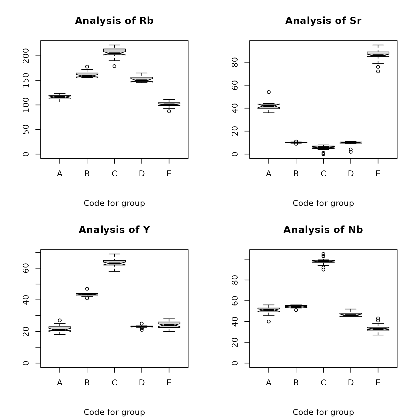
Figure 4.1: Box plots for the Jemez obsidian source data.
We can also create side-by-side box plots of the sources and the artifacts assigned to the sources, in order to see how well the distributions of the elements from artifacts correspond to the distributions of the corresponding sources. The plot below shows this comparison for rubidium and niobium; the code for the artifact is .a added to the code for the assigned source (e.g., the artifacts assigned to source x have the code x.a). We see that, for the artifacts assigned to sources A and E, the artifact values for rubidium are larger than the corresponding source values and also are more variable. For one artifact assigned to source D, the niobium value is a clear outlier, suggesting a misclassified artifact.
library(predictSource)
data(ObsidianSources)
data(ObsidianArtifacts)
analyticVars <- c("Rb", "Sr", "Y", "Zr", "Nb")
ObsidianSources <- ObsidianSources[, c("Code", analyticVars)]
Artifacts <- ObsidianArtifacts[, c("Code", analyticVars)]
sourcesCode <- as.vector(ObsidianSources[, "Code"], mode = "character")
artifactsCode <-
  as.vector(paste(Artifacts[, "Code"], "a", sep = "."), mode = "character")
codes <- c(sourcesCode, artifactsCode)
sourcesArtifacts <-
  data.frame(rbind(ObsidianSources, Artifacts)[, analyticVars], Code = codes)
boxPlots <-
  ps_boxPlots(
    data = sourcesArtifacts,
    GroupVar = "Code",
    Groups = "All",
    AnalyticVars = c("Rb", "Nb"),
    Nrow = 2,
    Ncol = 1
  )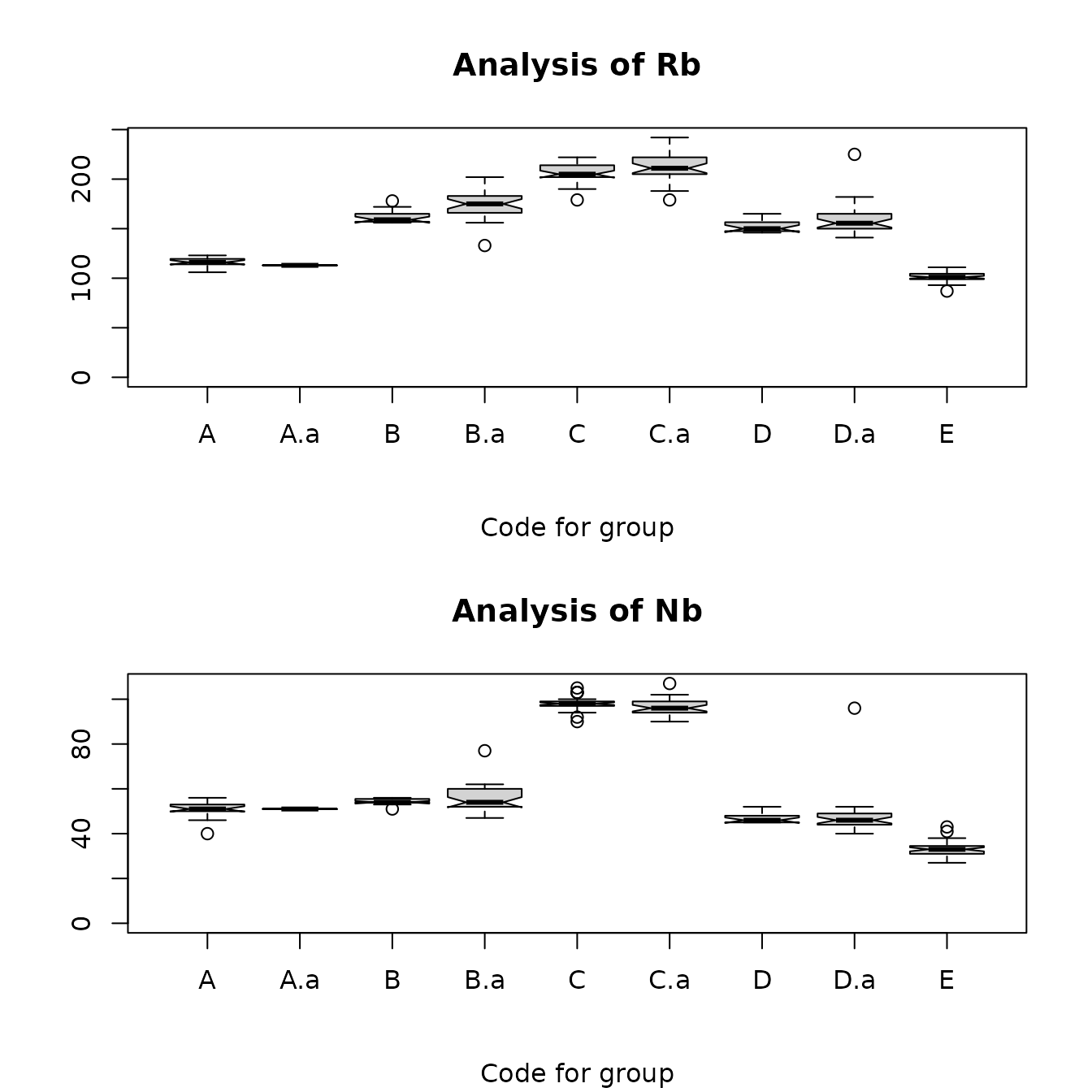
Figure 4.2: Box plots for rubidium and niobium comparing the Jemez obsidian sources and the obsidian artifacts assigned to those sources by Steve Shackley. x.a labels the artifacts assigned to source x.
Note that one artifact assigned to source D has values suggesting that it is actually from source C, and that one assigned to source B has values that suggest it is from another source (the rubidium value suggests source D). These plots may be useful in evaluating the accuracy of source predictions.
Pairs plots
A pairs plot, useful in visualizing the relations between pair of
variables, is a matrix containing bivariate scatter plots for all pairs
of quantitative variables. The matrix is symmetric, so corresponding
plots across the main diagonal interchange the horizontal and vertical
axes. Each plot contains a robust locally weighted line to describe the
trend in the data. This line is obtained from the R function
lowess() which computes a predicted value at each abscissa
(x-value) from a regression based on a fraction of the data, with
weights decreasing at abscissas farther from the point, and rejecting
outliers (see e.g. Chambers et al., 1983, Chapter 4). This function
tends to try to have the line go through or near the points with the
largest and smallest abscissas; therefore the behavior at the ends of
the plot is not reliable. The line is obtained from the function
panel.smooth() within the call to pairs() with an argument
span. The line (smoother) will not be useful if there are very few
values; an example plot demonstrates that trends may show useful results
even with 15 values.
The plot is obtained with the function ps_pairsPlot() and the arguments data, GroupVar, Groups, AnalyticVars, and Span. All except Span have the same meanings as in the function ps_boxPlots(). Span is a value between 0 and 1 (not equal to 0) defining the proportion of data used to estimate robust smooth; the function is written with a default value of 2/3, which can be changed. A small value (such as 0.1) will produce plots which do not show a clear trend; a large value (close to 1) will produce plots which do not show changes in trends. Running the function will produce warnings that span is not a graphical parameter; these warnings should be ignored.
The plot below of the relations between elements at source A shows that the relationships between rubidium and yttrium, and between rubidium and zirconium, are approximately linear, but that, roughly, there is no relation between the values of strontium and those of yttrium and zirconium. Note that it is necessary to look at both scatterplots of the relation between a pair of variables, as limited variation in one variable and dependence of the location of the largest and smallest values of one variable can make there seem to be a relationship (see the plots of strontium as the ordinate versus yttrium or zirconium).
library(predictSource)
data(ObsidianSources)
analyticVars <- c("Rb", "Sr", "Y", "Zr", "Nb")
pairsPlot <-
  ps_pairsPlot(
    data = ObsidianSources,
    GroupVar = "Code",
    Groups = "A",
    AnalyticVars = analyticVars
  )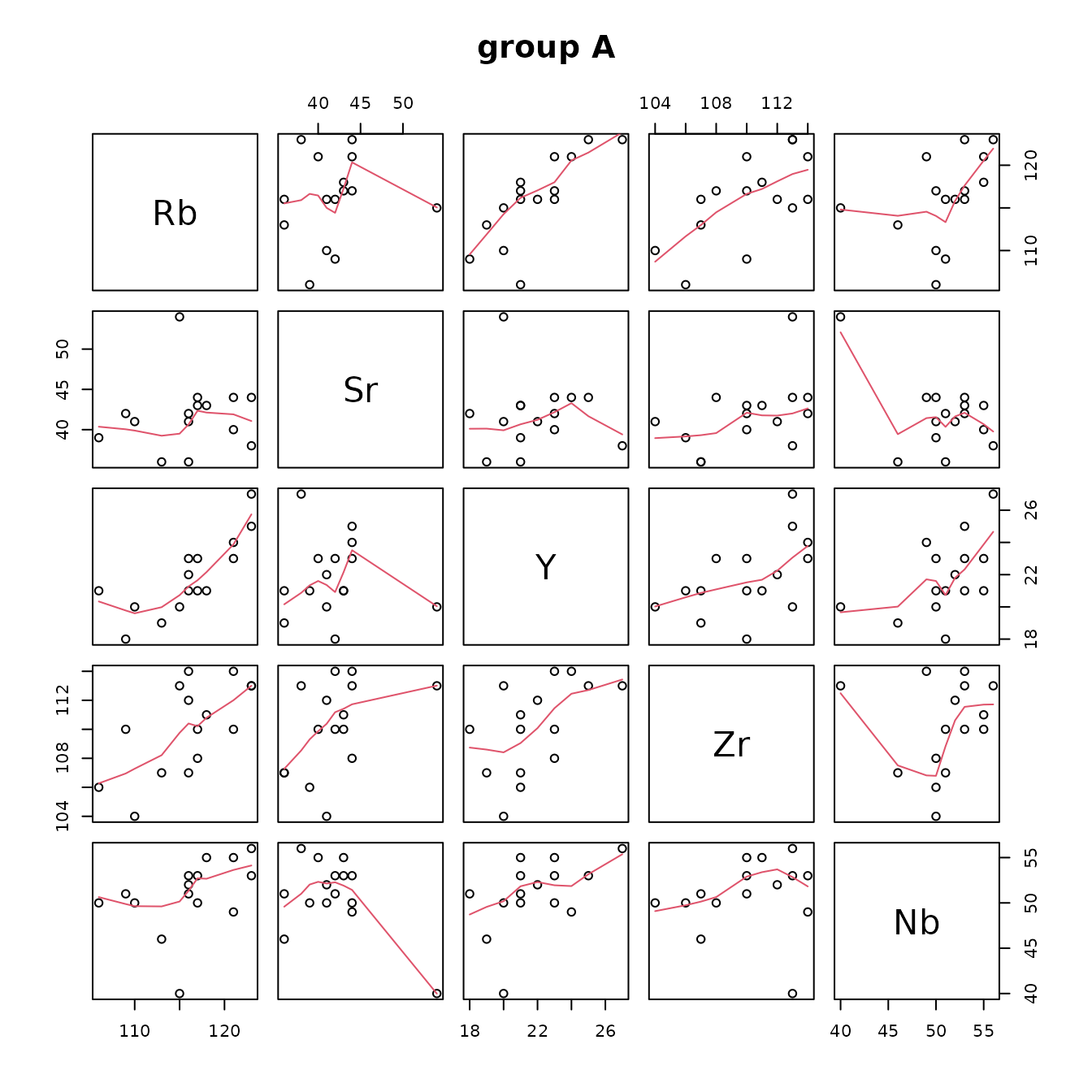
FIgure 4.3: Pairs plots of the Jemez obsidian source data.
Coefficients of variation of elements and correlations between pairs of elements
Numerical estimates of the associations between pairs of analytic variables at each source, in the form of Spearman correlation coefficients, are produced by the function ps_CV_corr(). This function also produces an estimate of the coefficient of variation (the standard deviation divided by the mean) for each variable at each source. Because the Spearman correlation coefficient is computed from the ranks of the data, it is not affected by the numerical value of an outlier. The coefficient of variation does use the numerical values, hence is affected by an outlier. This function returns a list with elements with the names CV (the coefficients of variation) and corr (the correlations). By default, both the coefficients of variation and the correlations are rounded to two decimal places.
Table 4.1 contains the Spearman correlation coefficient estimates for all pairs of variables at each source. Each estimate describes how close the relation between a pair of variables is to strictly monotone. If a relationship is roughly monotone, the correlation coefficient does not describe how rapidly one variable changes with respect to the other (the correlation coefficient for a linear relationship can be large even if the slope of the line describing the relationship is small). For example, the estimated correlation between strontium and zirconium at source A is 0.51, even though the pairs plot of these elements with strontium as the ordinate shows that strontium increases slowly as zirconium increases. The correlation table is very useful for summarizing relationships between pairs of elements at the sources: it is clear that these relationships vary substantially among these sources.
Table 4.2 contains the Spearman correlation coefficients if group membership is ignored. The high correlation between pairs of variables suggests that principal components will be a useful method for showing the variation among source groups in two dimensions.
library(predictSource)
data(ObsidianSources)
analyticVars <- c("Rb", "Sr", "Y", "Zr", "Nb")
CV_corr <-
  ps_CV_corr(
    data = ObsidianSources,
    GroupVar = "Code",
    Groups = "All",
    AnalyticVars = analyticVars,
    plotCorrs = FALSE
  )
knitr::kable(CV_corr$corr, caption = "Table 4.1: Spearman correlations among pairs of elements from the Jemez sources,
by group.") %>%
kable_styling(full_width = F, position = "center")| Rb/Sr | Rb/Y | Rb/Zr | Rb/Nb | Sr/Y | Sr/Zr | Sr/Nb | Y/Zr | Y/Nb | Zr/Nb | |
|---|---|---|---|---|---|---|---|---|---|---|
| A | 0.26 | 0.83 | 0.58 | 0.60 | 0.16 | 0.51 | -0.17 | 0.57 | 0.50 | 0.28 |
| B | 0.57 | 0.32 | 0.37 | 0.08 | 0.45 | 0.47 | 0.20 | 0.55 | 0.51 | 0.60 |
| C | -0.26 | 0.80 | 0.80 | 0.59 | -0.02 | -0.26 | 0.13 | 0.78 | 0.60 | 0.45 |
| D | -0.13 | -0.11 | 0.15 | 0.75 | 0.31 | 0.85 | -0.04 | 0.17 | 0.16 | 0.13 |
| E | 0.63 | 0.25 | 0.23 | 0.22 | 0.31 | 0.44 | 0.18 | 0.25 | 0.13 | 0.31 |
#
data(ObsidianSources)
analyticVars <- c("Rb", "Sr", "Y", "Zr", "Nb")
CV_corr <-
  ps_CV_corr(
    data = ObsidianSources,
    GroupVar = "Code",
    Groups = "All",
    AnalyticVars = analyticVars,
    ByGroup = FALSE,
    plotCorrs = FALSE
  )
knitr::kable(CV_corr$corr, caption = "Table 4.2: Spearman correlations among pairs of elements from the Jemez obsidian sources, all groups combined.") %>%
kable_styling(full_width = F, position = "center")| Rb | Sr | Y | Zr | Nb | |
|---|---|---|---|---|---|
| Rb | 1.00 | -0.88 | 0.72 | 0.57 | 0.92 |
| Sr | -0.88 | 1.00 | -0.59 | -0.42 | -0.85 |
| Y | 0.72 | -0.59 | 1.00 | 0.85 | 0.69 |
| Zr | 0.57 | -0.42 | 0.85 | 1.00 | 0.59 |
| Nb | 0.92 | -0.85 | 0.69 | 0.59 | 1.00 |
#Figure 4.4 contains a graphical display of these correlations. The slope of the semi-major axis of each ellipse indicates whether the corresponding correlation is positive or negative; the width of the ellipse (the length of the semi-minor axis) indicates the magnitude of the correlation (a shorter axis [narrower ellipse] indicates stronger correlation) as does the color of the ellipse.
data(ObsidianSources)
analyticVars <- c("Rb", "Sr", "Y", "Zr", "Nb")
CV_corr <-
  ps_CV_corr(
    data = ObsidianSources,
    GroupVar = "Code",
    Groups = "All",
    AnalyticVars = analyticVars,
    ByGroup = FALSE,
    plotCorrs = TRUE
  )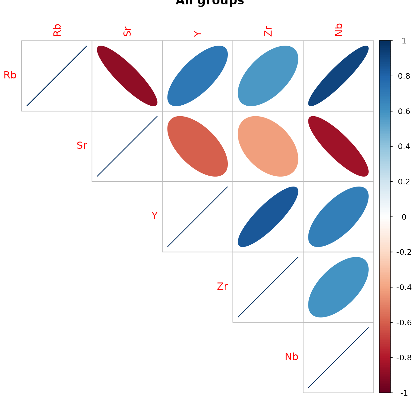
Figure 4.4: Graphical display of the correlations between the Jemez obsidian source analysis variables with all groups combined.
Table 4.3 shows the coefficients of variation for each element at each source. Each standard deviation is small compared to the corresponding mean (each coefficient of variation is at most 0.11, and most are 0.05 or less) except for strontium at sources C and D. The relatively large values of the coefficient of variation for strontium at those sources is a result of the small mean strontium values at those sources: the table of descriptive statistics (Table 3.2) gives mean values for strontium of 5 and 10, at C and D, respectively, with ranges of 0 to 8 and 2 to 11, respectively.
data(ObsidianSources)
analyticVars <- c("Rb", "Sr", "Y", "Zr", "Nb")
CV_corr <-
  ps_CV_corr(
    data = ObsidianSources,
    GroupVar = "Code",
    Groups = "All",
    AnalyticVars = analyticVars,
    ByGroup = TRUE,
    plotCorrs = FALSE
  )
knitr::kable(CV_corr$CV, caption = "Table 4.3:  Coefficients of variation of the elements from the Jemez sources.") %>%
kable_styling(full_width = F, position = "center")| Code | Rb | Sr | Y | Zr | Nb |
|---|---|---|---|---|---|
| A | 0.04 | 0.10 | 0.11 | 0.03 | 0.08 |
| B | 0.04 | 0.05 | 0.03 | 0.03 | 0.02 |
| C | 0.04 | 0.44 | 0.04 | 0.04 | 0.03 |
| D | 0.04 | 0.29 | 0.04 | 0.04 | 0.04 |
| E | 0.05 | 0.05 | 0.09 | 0.06 | 0.10 |
#Two-and three-dimensional scatterplots
Two- and three-dimensional scatterplots are very useful in visualizing relationships among elements. The user can obtain these plots from the functions ps_2dPlot() and ps_3dPlot(), respectively. Several sources can be shown on a single plot, with different colors identifying the sources. If there are a large number of sources, the user can plot medians instead of points. For two dimensional plots, the user can show additional information: Gaussian confidence ellipses for the values from each source; the convex hull of the points from each source; either of two nonparametric curves describing the relation between elements at a source, a lowess smooth or kernel smoother. The user can also identify points of interest (e.g. outliers) on a two-dimensional plot and create a data frame containing the data yielding those points. The function ps_2dPlotGauss() computes test statistics for checking that a pair of elements at a source has a bivariate Gaussian distribution. The function ps_3dPlotRotate() allows the user to rotate a three-dimensional plot.
Examples of two-dimensional scatterplots are below. The first two show plots of two pairs of elements (rubidium/zirconium and rubidium/niobium) from sources A and B , with 95% and 99% Gaussian confidence ellipses; the first and second include lowess and kernel smooths for the points, respectively. The two types of smoothers show similar trends; the kernel smooths could be made less wiggly by increasing the default value (0.3) of the span parameter KernelWidth.
The next two plots show examples of all sources on one plot for zirconium versus rubidium. The first of these shows the convex hull of the points at each source, with the source symbol plotted as the median of the points. We see, for example, that the medians at sources B and D are close to the smallest values of rubidium, indicating that, for each source, there are one or more rubidium values that are large compared to most of the values. The second plot shows the points and confidence ellipses at each source, with colors and plotting characters identifying the sources. Requesting this plot with Identify = TRUE allows the user to create a data set (plot_2d$data.check) containing the data generating points that may be of interest. Table 4.4 shows the data generating five such points. For example, the point from source E has a strontium value of 72, which is smaller than the value from any other sample from source E.
The confidence ellipses provide information on whether the distributions of a pair of elements differ between or among sources. If a bivariate distribution is Gaussian and 99% confidence ellipses do not overlap between or among sources, it is plausible that the distributions of a pair of elements between or among sources do not overlap. The function ps_2dPlotGauss(), discussed below, provides plots and tests to evaluate the hypothesis that a bivariate distribution is Gaussian. To anticipate, we find that the rubidium/zirconium distribution is likely to be Gaussian at source A but not at source B. Note that the source values roughly fill the 95% confidence ellipse at source A, but those values tend to cluster at source B, and two lie approximately on the boundary of the 99% confidence ellipse.
data(ObsidianSources)
analyticVars <- c("Rb", "Sr", "Y", "Zr", "Nb")
plot_2d <-
  ps_2dPlot(
    data = ObsidianSources,
    GroupVar = "Code",
    ID = "ID",
    Groups = c("A", "B", "C", "D"),
    AnalyticVars = analyticVars,
    VariablePairs = analyticVars[c(1, 4)],
    PlotEllipses = TRUE,
    LowessLine = TRUE,
    ByGroup = TRUE
  )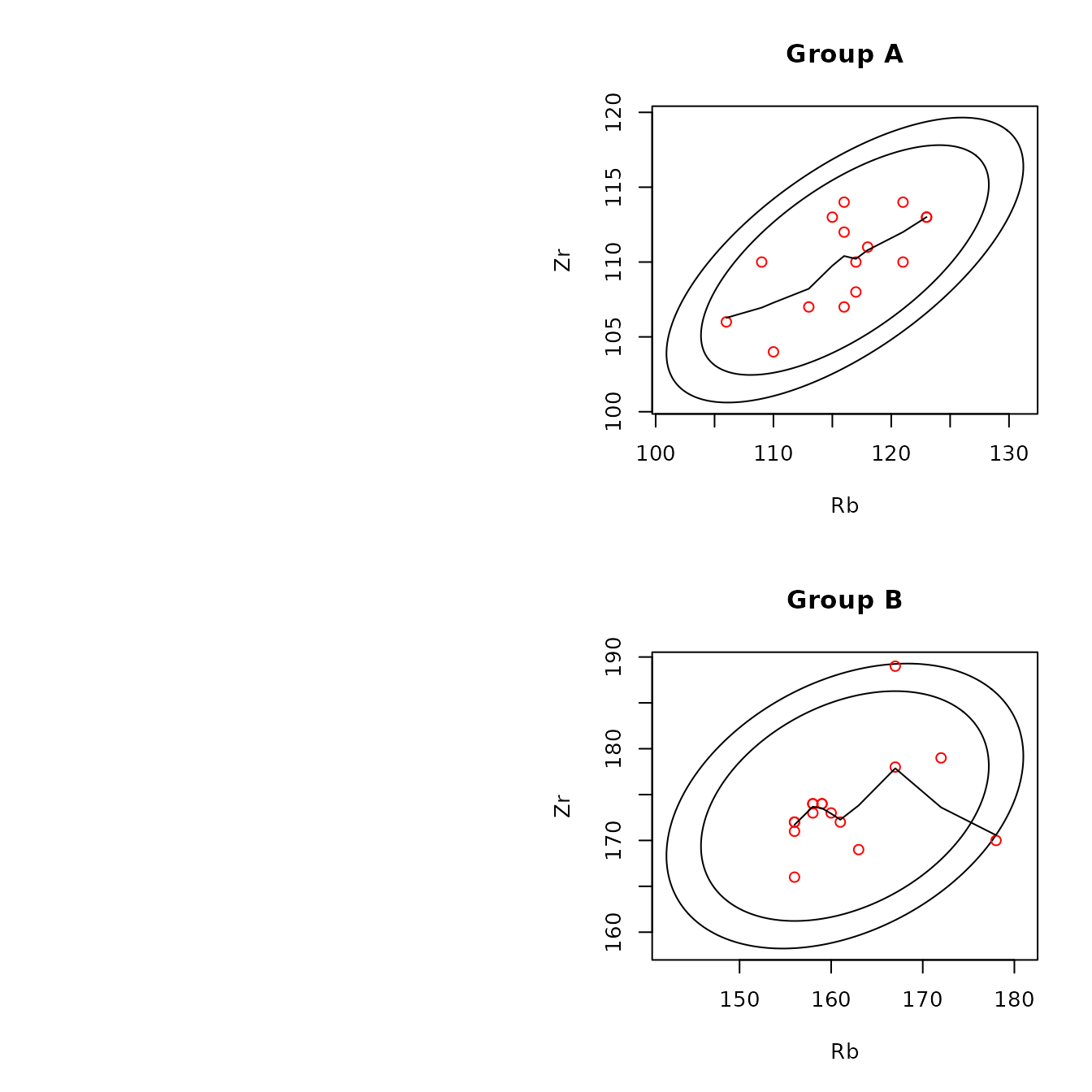
Figure 4.5: Example of scatterplots for the obsidian Jemez source data with confidence ellipses and robust lowess smoothing lines.
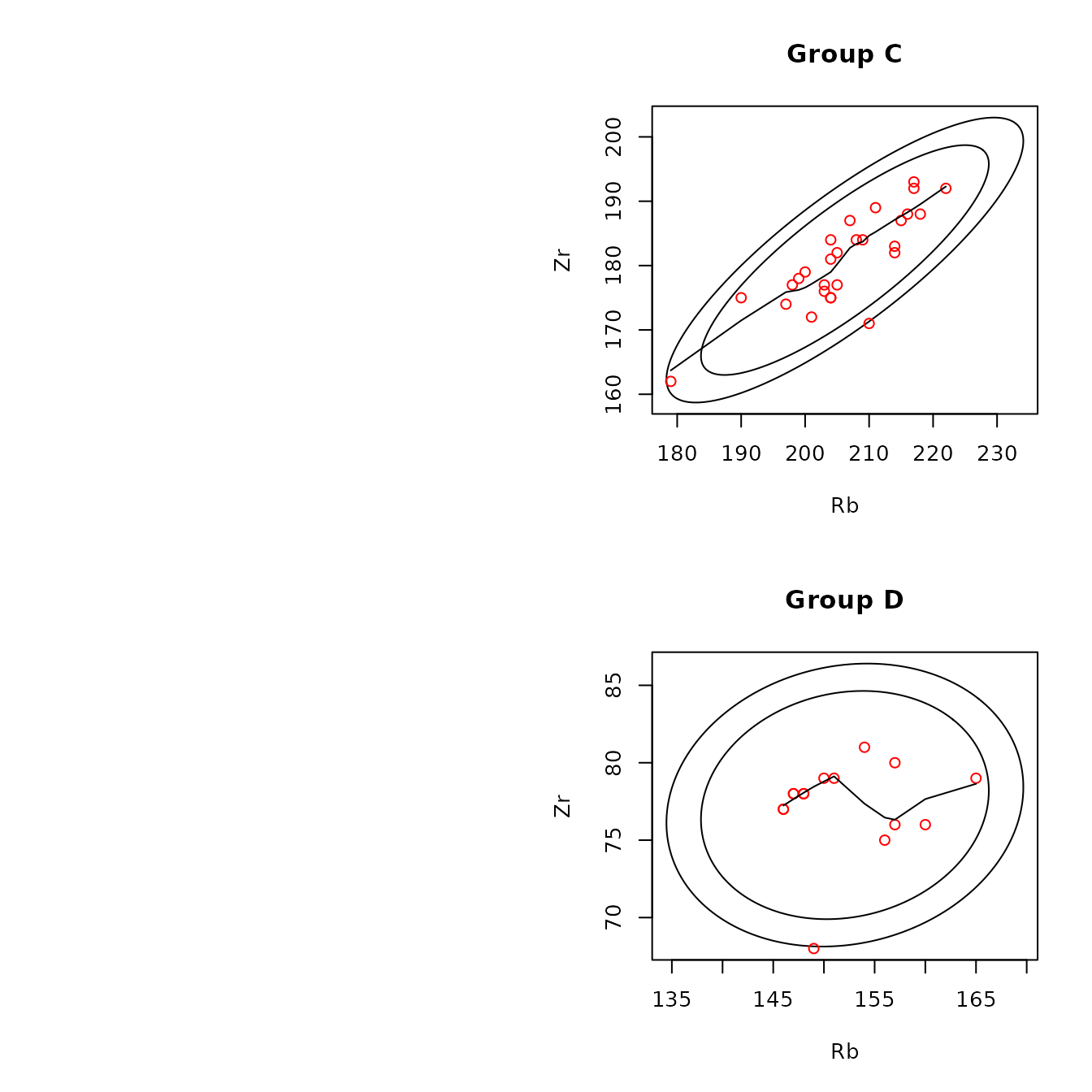
Figure 4.5: Example of scatterplots for the obsidian Jemez source data with confidence ellipses and robust lowess smoothing lines.
data(ObsidianSources)
analyticVars <- c("Rb", "Sr", "Y", "Zr", "Nb")
plot_2d <-
  ps_2dPlot(
    data = ObsidianSources,
    GroupVar = "Code",
    ID = "ID",
    Groups = c("A", "B", "C", "D"),
    AnalyticVars = analyticVars,
    VariablePairs = analyticVars[c(1, 4)],
    PlotEllipses = TRUE,
    KernelSmooth = TRUE,
    LowessLine = FALSE,
    ByGroup = TRUE
  )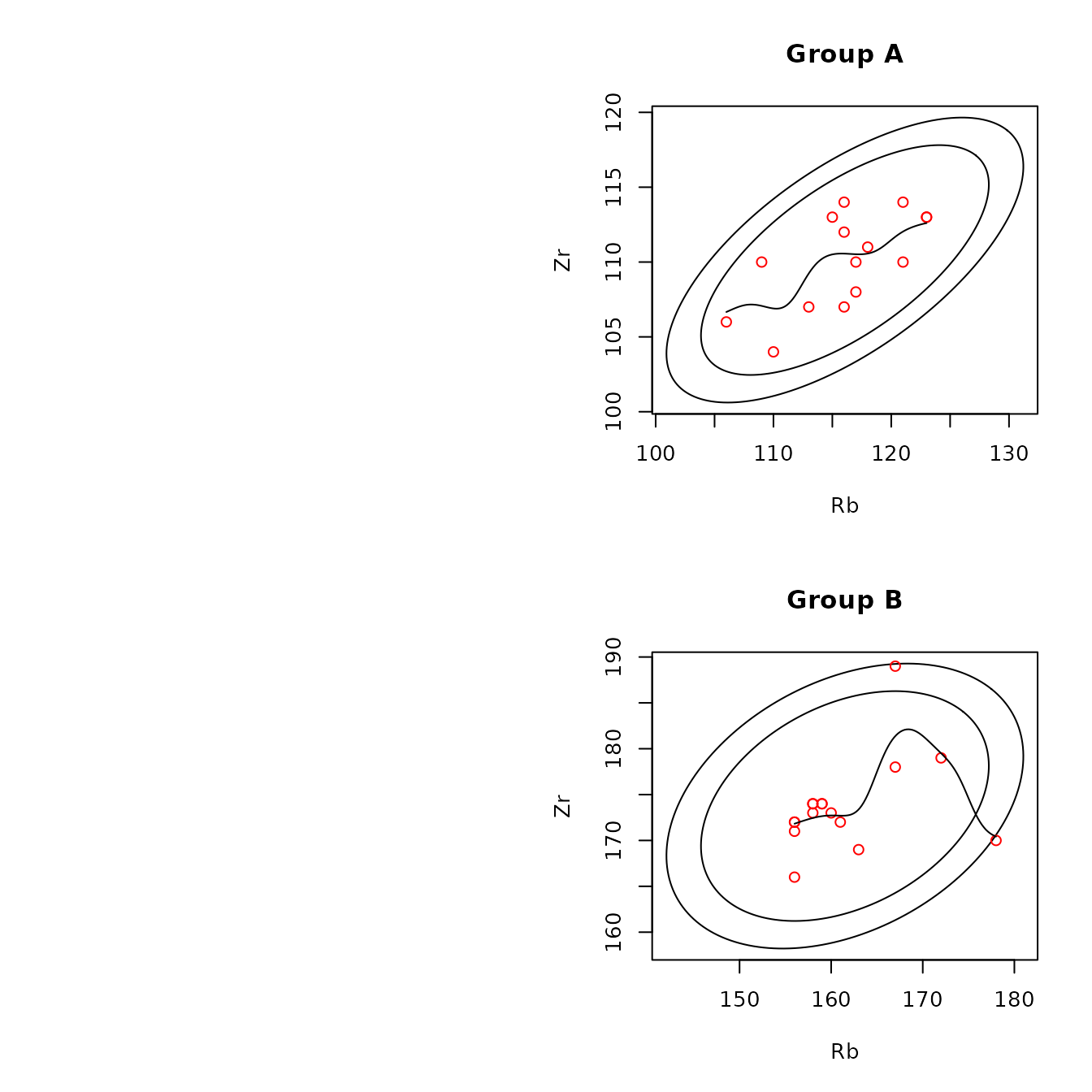
Figure 4.6: Example of a scatterplot for obsidian Jemez source data with confidence ellipses and kernel smoothing lines.

Figure 4.6: Example of a scatterplot for obsidian Jemez source data with confidence ellipses and kernel smoothing lines.
data(ObsidianSources)
analyticVars <- c("Rb", "Sr", "Y", "Zr", "Nb")
plot_2d <-
  ps_2dPlot(
    data = ObsidianSources,
    GroupVar = "Code",
    ID = "ID",
    Groups = "All",
    AnalyticVars = analyticVars,
    VariablePairs = analyticVars[1:2],
    ByGroup = FALSE,
    PlotPoints = FALSE,
    PlotMedians = TRUE,
    PlotHulls = TRUE,
    LowessLine = FALSE
  )
Figure 4.7: Example of a scatterplot for obsidian Jemez source data with the median values of and convex hulls of the points at each source.
data(ObsidianSources)
analyticVars <- c("Rb", "Sr", "Y", "Zr", "Nb")
plot_2d <-
  ps_2dPlot(
    data = ObsidianSources,
    GroupVar = "Code",
    ID = "ID",
    Groups = "All",
    AnalyticVars = analyticVars,
    VariablePairs = analyticVars[c(1, 4)],
    ByGroup = FALSE,
    PlotEllipses = TRUE,
    LowessLine = TRUE,
    PlotAllGroups = TRUE
  )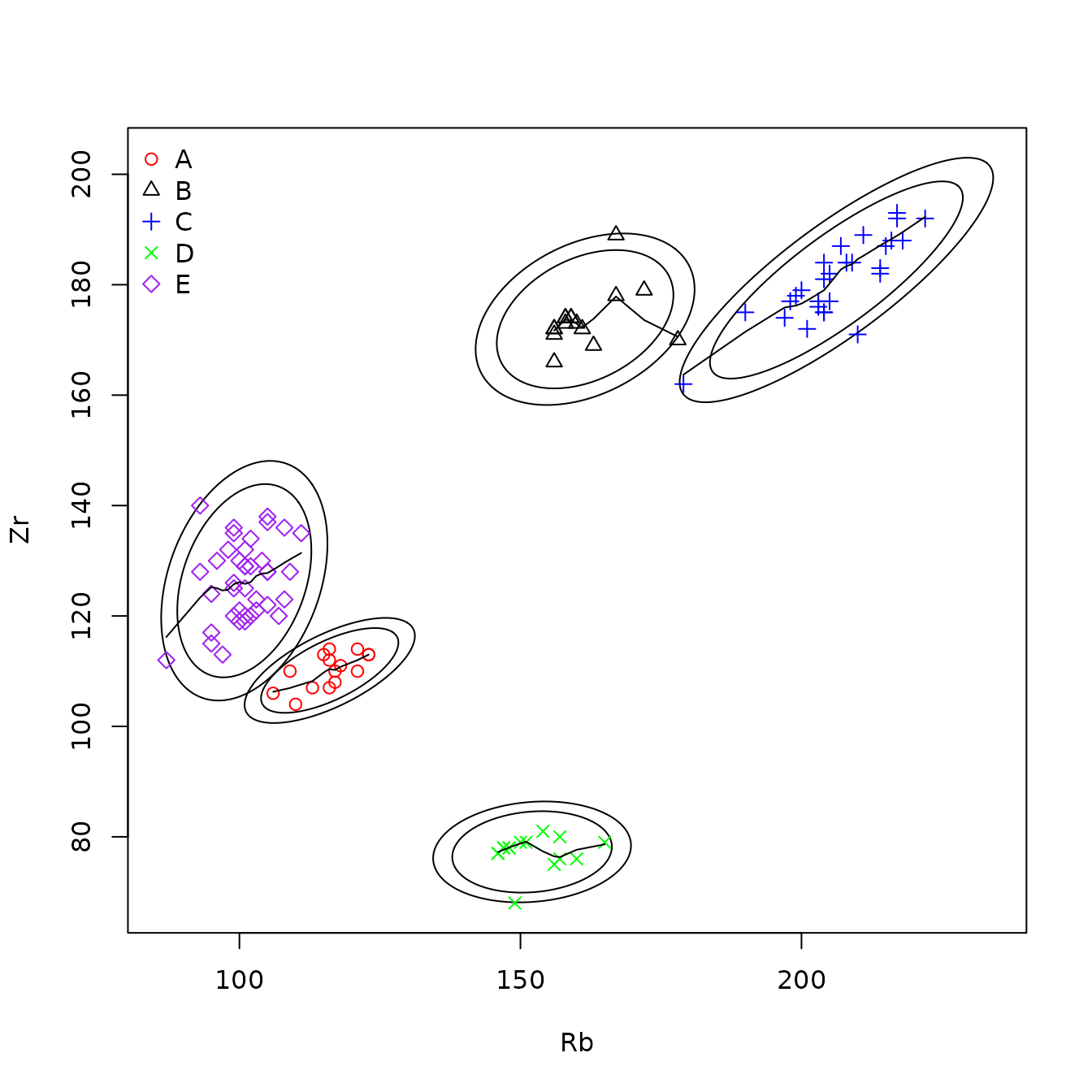
Figure 4.8: Example of a scatterplot for obsidian Jemez source data with data for all sources, with confidence ellipses and robust lowess smoothing lines.
data("sources.data.check")
knitr::kable(sources.data.check, caption = "Table 4.4: Data generating identified points.") %>%
kable_styling(full_width = F, position = "center")| Code | ID | Rb | Sr | Y | Zr | Nb | |
|---|---|---|---|---|---|---|---|
| 8 | A | A8 | 115 | 54 | 20 | 113 | 40 |
| 40 | C | C9 | 179 | 1 | 58 | 162 | 92 |
| 63 | D | D4 | 149 | 4 | 25 | 68 | 49 |
| 64 | D | D5 | 156 | 2 | 23 | 75 | 45 |
| 84 | E | E10 | 108 | 72 | 22 | 123 | 43 |
#The function ps_3dPlot() creates one or more three-dimensional scatterplots. If two or more groups (sources) are shown on the same plot, different colors identify the groups, as in the example below. The colors are specified in the parameter Colors; if several groups are shown on the same plot, there must be at least as many colors as groups; the default value of the parameter Colors has five colors (red, black, blue, green, purple); colors are used in that order. The user can rotate the plot using the function ps_3dPlotRotate().
file:///C:/Consulting/Sourcing/Vignette/scatterRbSrY.doc
library(predictSource)
data(ObsidianSources)
analyticVars <- c("Rb", "Sr", "Y", "Zr", "Nb")
plot3d <-
  ps_3dPlot(
    data = ObsidianSources,
    GroupVar = "Code",
    Groups = c("A", "B", "C"),
    AnalyticVars = analyticVars,
    Selections = rbind(analyticVars[1:3], analyticVars[2:4])
  )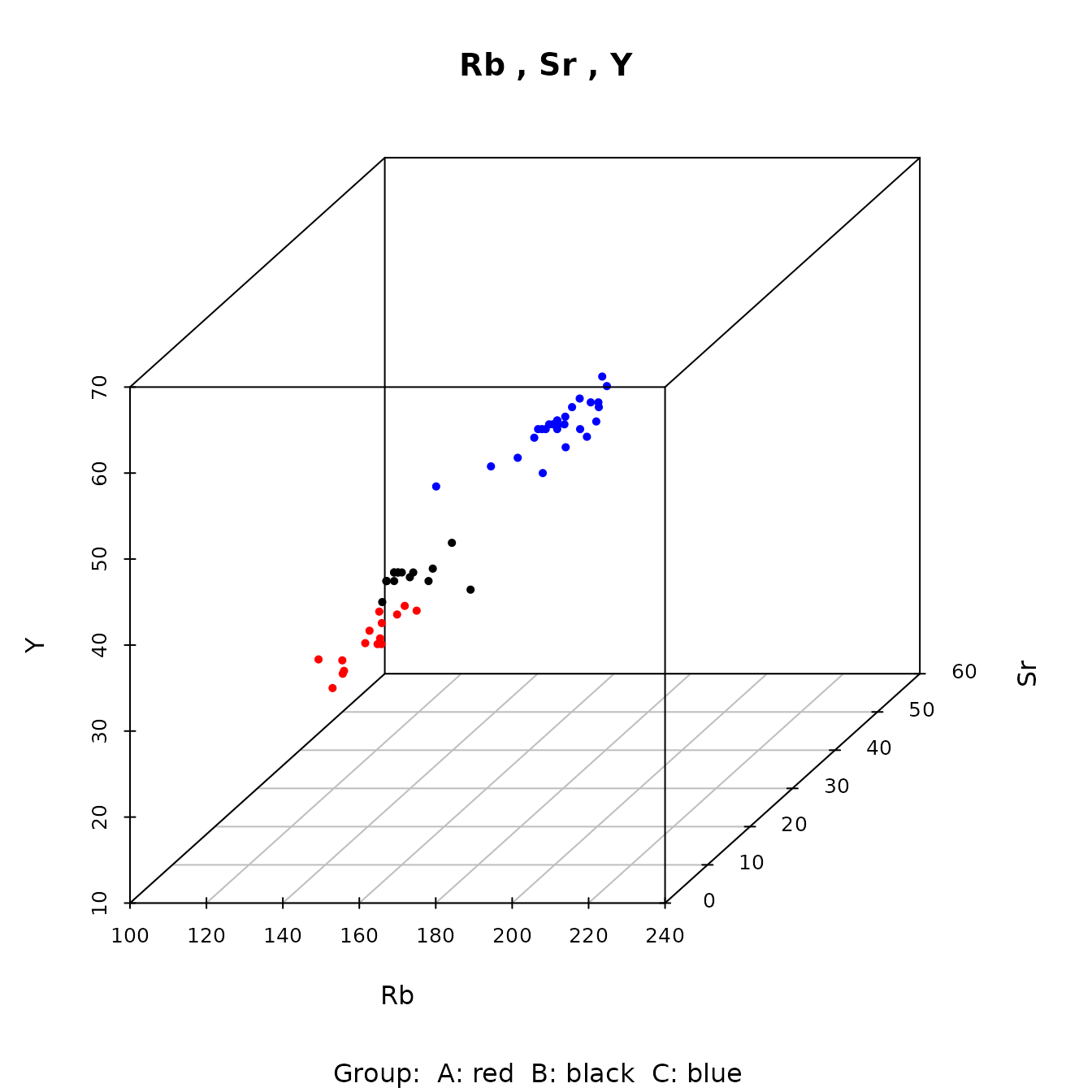
Figure 4.9: Example of a three-dimensional plot showing data from three Jemez obsidian sources.
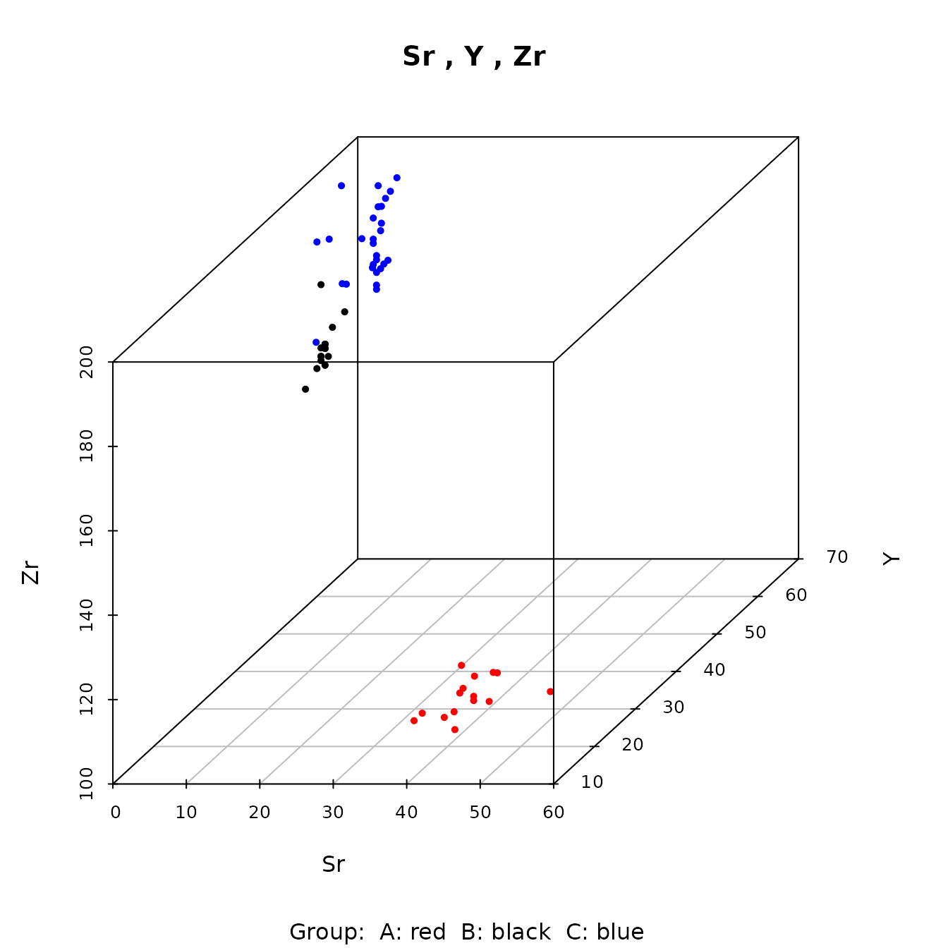
Figure 4.9: Example of a three-dimensional plot showing data from three Jemez obsidian sources.
Evaluating bivariate normality
The function ps_2dPlotGauss() allows the user to
evaluate the hypothesis that a pair of variables has a bivariate
Gaussian distribution in a group (source). This function is also used in
the function ps_pcaGaussian() to evaluate whether the first
two principal components at a group have a bivariate distribution;
therefore, the discussion in this section is also appropriate for a
similar analysis of principal components results. In either case,
evaluating bivariate normality is useful in deciding whether a
confidence ellipse is valid for describing the variation in the data at
a group. This function uses scatter plots and hypothesis tests. It is
essential to note that, if the hypothesis tests fail to reject the null
hypothesis of a Gaussian distribution, we CANNOT concude that the
distribution is Gaussian. It may be plausible to believe that the
bivariate distribution is approximately Gaussian, and therefore the
confidence ellipses may be useful in identifying observations of
interest.
For a pair of variables to have a bivariate Gaussian distribution, each variable must have a univariate Gaussian distribution, and the bivariate distribution must also be Gaussian. Note that, if the bivariate distribution is not Gaussian, one of these conditions can be true (each condition is necessary but not sufficient). The function ps_2dPlotGauss() displays Q-Q plots giving the user information on whether the univariate distributions may be Gaussian. The function also computes p-values for test statistics for univariate Gaussian distributions and for a bivariate Gaussian distribution. These p-values are in the component named pvalues in the list returned by the function. This function also allows users to identify points of interest in the univariate Q-Q plots (if the parameter Identify=TRUE); the component dataCheck in the list returned by the function contains the data generating the points of interest.
A Q-Q plot is a quantile-quantile plot of the sample quantiles for univariate data versus the theoretical quantiles for a univariate Gaussian distribution. Therefore, if the univariate distribution is Gaussian, the points on the plot are roughly linear. Points with the largest values that are above the trend line indicate a distribution with a short right tail; points with the smallest values that are above the trend line indicate a distribution with a short left tail. The opposite behaviors at the extreme indicate long tails. See e.g. Chambers et al., Chapter 6, for a discussion of Q-Q plots.
In addition to the standard Q-Q plot, the ps_2dPlotGauss() function implements a more informative plot. To obtain this plot, a large number (by default, 1000) Gaussian distributions are simulated from the observed mean and variance of a data set. The upper and lower 95% and 99% confidence bands for the points in the simulated Q-Q plots are computed and plotted, along with the observed points (in blue). Observed points that fall within the 95% bands (and perhaps the 99% bands) should not be regarded as unusual. Thus, the simulated plot figure provides information on whether a point that appears to depart from the trend line is unusual. The simulated Q-Q plot is computed from the user-contributed function qqtest(); see Oldfield for a discussion and details. The function ps_2dPlotGauss() function produces the simulation and standard Q-Q plots side-by-side for each data set.
If qqPlot is TRUE, the function also produces the multivariate Q-Q plot. This plot is based the fact that, if the data are Gaussian, the generalized distances of the points from the mean (the squared Mahalanobis distances) have a chi-squared distribution with two degrees of freedom (Johnson and Wichern, section 4.6).
There are many statistical tests for univariate and bivariate Gaussian distributions. The univariate tests have variable power against different violations of the Gaussian assumption. The function ps_2dPlotGauss() implements two of the univariate tests, the Anderson-Darling and the Shapiro-Wilk tests. Properties and definitions of many tests are in D’Agostino and Stephens, Chapter 9, Tests for the Normal Distribution. In that chapter, D’Agostino states “the Anderson-Darling A2 test…is the EDF test we recommend for us[e]” (page 372) and “The most powerful EDF test appears to be the Anderson-Darling A2 …. It is at times presented as being similar in power to the Shapiro-Wilk W test.” (page 404). The p-values for those two tests are in a table produced by this function, in columns with names AD.variable_name and SW.variable_name, respectively. The table also contains the p-values from three tests for a bivariate Gaussian distribution: Mardia’s test based on skewness and kurtosis (D’Agostino and Stephens, page 409), and tests developed by Henze and Zirkler and by Royston. These tests use the mvn() function in the user-contributed package MVN. The Royston test may be most appropriate for these relatively small sample sizes: Farrell, Salibian-Barrera, and Naczk comment that “A consistent and invariant test proposed by Henze and Zirkler…is found to have good power properties, particularly for sample sizes of 75 or more, while an approach suggested by Royston… performs effectively at detecting departures from MVN for smaller sample sizes.” The sample sizes and p-values for the tests are in the component named pvalues in the list returned by the function; examples are in Tables 7a and 7b, below.
Q-Q plots evaluating the assumptions of univariate and bivariate Gaussian distributions for the bivariate rubidium/zirconium and rubidium/niobium pairs are below, as well as two examples of the multivariate Q-Q plot. It is instructive to compare the univariate Q-Q plots with and without simulation, in order to evaluate which data points clearly are not consistent with a univariate Gaussian distribution, and to compare these with the p-values in Tables 4.5 and 4.6. We also note that a value far from a univariate Q-Q line yields a value far from this line on the bivariate Q-Q plot.
Rubidium/zirconium:
At source A, the Q-Q plot suggests that the distribution of rubidium has
a long left tail. However, the plot using simulation shows that the
sample points are well within the 95% confidence region. One zirconium
value is large but within the 95% confidence region in the simulated
plot. The p-values for both univariate tests for both elements are
relatively large. Thus, both the results from the simulation Q-Q plots
and the formal test statistics support approximate univariate Gaussian
distributions for both elements. The multivariate Q-Q plot has a short
right tail based on one value. The p-values for all four tests for
bivariate normality are also large (at least 0.24). Therefore, it is
plausible that these elements have an approximate bivariate Gaussian
distribution at source A. This conclusion is consistent with the
scatterplot with confidence ellipses in Figure 4.8.
In contrast, at source B, the Q-Q plots show that both elements have short right tails. The univariate test statistics have p-values less than 0.01. The multivariate Q-Q plot has two extreme values. All four multivariate tests yield small p-values (at most 0.005). We conclude that these elements do not have a bivariate Gaussian distribution at source B. This conclusion is also consistent with the scatterplot in Figure 4.8.
Rubidium/niobium: From the previous discussion, we know that rubidium has an approximate Gaussian distribution at source A but not at source B. At source A, the univariate test statistics have marginally “significant” p-values. The multivariate Q-Q plot has a short right tail based on one value. The Royston test yields a p-value of 0.065. Based on these results, we may be willing to assume an approximate bivariate Gaussian distribution for these two elements at source A. However, the scatterplot with confidence ellipses in Figure 4.7 is of concern, as the lowess smooth is not linear, and there is one point on the boundary of the 99% ellipse. If appears useful to look at scatterplots and smooths in evaluating whether distributions are Gaussian.
Since niobium has many samples with equal values, it is clear that niobium does not have a Gaussian distribution (this is confirmed by the p-values from the univariate tests). The Henze-Zirkler and Royston tests properly reject bivariate normality, even though the Mardia tests do not. The same phenomenon occurs at sources C, D, and E. This reinforces the preference for these tests.
library(predictSource)
data(ObsidianSources)
analyticVars <- c("Rb", "Sr", "Y", "Zr", "Nb")
plot2dGauss <-
  ps_2dPlotGauss(
    data = ObsidianSources,
    GroupVar = "Code",
    ID = "ID",
    Groups = "A",
    AnalyticVars = analyticVars,
    variablePair = c("Rb", "Zr"),
    QQPlot = TRUE
  )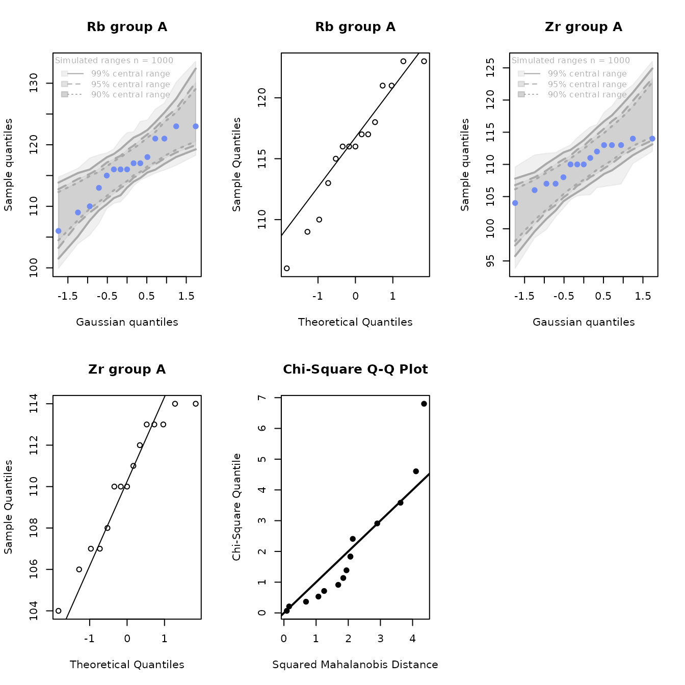
Figure 4.10a: Q-Q plots of rubidium and zirconium, including the bivariate Q-Q plot, for the Jemez obsidian source data from source A.
library(predictSource)
data(ObsidianSources)
analyticVars <- c("Rb", "Sr", "Y", "Zr", "Nb")
plot2dGauss <-
  ps_2dPlotGauss(
    data = ObsidianSources,
    GroupVar = "Code",
    ID = "ID",
    Groups = "B",
    AnalyticVars = analyticVars,
    variablePair = c("Rb", "Zr")
  )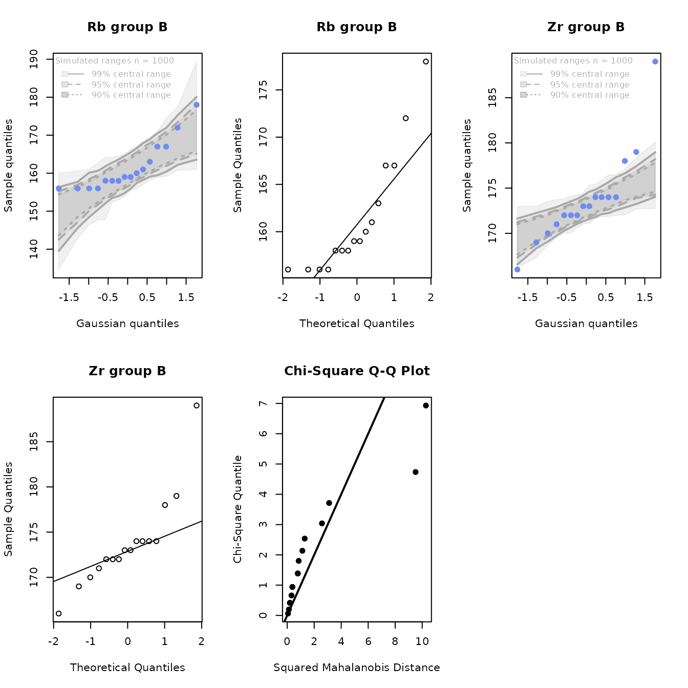
Figure 4.10b: Q-Q plots of rubidium and zirconium, including the bivariate Q-Q plot, for the Jemez obsidian source data from source B.
library(predictSource)
data(ObsidianSources)
analyticVars <- c("Rb", "Sr", "Y", "Zr", "Nb")
plot2dGauss <-
  ps_2dPlotGauss(
    data = ObsidianSources,
    GroupVar = "Code",
    ID = "ID",
    Groups = c("A", "B"),
    AnalyticVars = analyticVars,
    variablePair = c("Rb", "Nb"),
    QQPlot = FALSE
  )
Figure 4.10c: Q-Q plots of rubidium and niobium for the Jemez obsidian source data from sources A and B.
| group | n | AD_Rb | AD_Zr | SW_Rb | SW_Zr | maridaSkew | mardiaKurtosis | HZ | Royston |
|---|---|---|---|---|---|---|---|---|---|
| A | 15 | 0.440 | 0.310 | 0.462 | 0.269 | 0.814 | 0.242 | 0.398 | 0.416 |
| B | 16 | 0.004 | 0.009 | 0.004 | 0.009 | 0.000 | 0.005 | 0.000 | 0.000 |
| C | 28 | 0.296 | 0.613 | 0.165 | 0.534 | 0.108 | 0.333 | 0.837 | 0.218 |
| D | 15 | 0.084 | 0.006 | 0.070 | 0.003 | 0.004 | 0.299 | 0.002 | 0.001 |
| E | 39 | 0.477 | 0.580 | 0.615 | 0.610 | 0.377 | 0.703 | 0.767 | 0.664 |
| group | n | AD_Rb | AD_Nb | SW_Rb | SW_Nb | maridaSkew | mardiaKurtosis | HZ | Royston |
|---|---|---|---|---|---|---|---|---|---|
| A | 15 | 0.440 | 0.084 | 0.462 | 0.044 | 0.013 | 0.621 | 0.190 | 0.065 |
| B | 16 | 0.004 | 0.017 | 0.004 | 0.017 | 0.054 | 0.844 | 0.021 | 0.001 |
| C | 28 | 0.296 | 0.024 | 0.165 | 0.110 | 0.361 | 0.570 | 0.042 | 0.049 |
| D | 15 | 0.084 | 0.015 | 0.070 | 0.008 | 0.192 | 0.355 | 0.004 | 0.006 |
| E | 39 | 0.477 | 0.211 | 0.615 | 0.185 | 0.246 | 0.126 | 0.414 | 0.260 |
5. PRINCIPAL COMPONENTS ANALYSIS
Principal components analysis is a standard method implementing dimension reduction in order to create one or more two-dimensional plots to evaluate the separation of groups based on quantitative variables. The function ps_pca() in this package does a principal components analysis after standardizing the data (so that each variable has mean zero and variance 1), plots the first two principal components (with the options in ps_2dPlot()), and returns a list with the computed values of interest (defined below). The user can also produce a scree plot, showing the variances for each principal component, and, if the analysis is by group, box plots of the values of the component for each group for the first two components. An option for the principal components plot is to show confidence ellipses around the points from each group (source).
As in ps_2dPlot.Gauss(), the parameter Identify=TRUE in this function allows the user to identify points of interest if points are plotted and the analytic values defining group medians if medians are plotted. If points are identified, the data frame containing information on these points (dataCheck) is sorted by group name, and, if samples have IDs, by ID within group. As a result of the R sort convention, an ID of A1x (x an integer from 0 to 9) appears above an ID of A2.
The function ps_pcaGaussian() provides information to evaluate whether the points from each group have a bivariate Gaussian distribution, with the same information provided by the function ps_2dPlotGauss(). The user can create a data frame containing the data generating points of interest by setting the parameter gaussIdentify = T.
A principal components analysis requires that the data to be analyzed have no missing values (an observation with a missing value is deleted from the analysis). The function ps_pca() uses the function rfImpute() to impute a single value for any missing value, so that no observations have missing data and all observations can be analyzed. See the discussion in Section 9 (Discussion) for more information on this procedure. There is no imputation in ps_pcaGaussian(): this function analyzes only the observations with complete data.
5.1 Standard principal components analysis
The function ps_pca() returns a list with numerical information on the analysis. The component named variances is a data frame with the standard deviation, proportion of total variance, and cumulative proportion of variance for each component (see Table 5.1). The component named weights contains, for each component, the weight for each predictor variable (for the obsidian data, each element) used to compute the value of the component for that variable; these weights are standardized so that the sum of the squares of the weights for each component is 1 (see Table 5.2 for the results for this analysis). The components named Predicted and DataPlusPredicted contain the predicted principal component values and the original data plus the predicted values, respectively, for the data used in the analysis (see Table 5.3 for a partial table for the obsidian source data). In addition, if the user identifies points of interest, the data generating those points are in the component dataCheck.
For the obsidian data, the scree plot (Figure 5.1) shows that, of the five principal components, the first two components explain nearly all the variance in the source data. Table 5.1 shows that these components explain 96% of the total variance. A common rule of thumb is that the components used should explain at least 90% of the total variance. Therefore, we should be able to draw valid conclusions using the first two components.
The box plots (Figure 4.1) show that the first component separates the five Jemez sources, except possibly for sources A and D (their box plots overlap slightly). The box plots for A and D are widely separated by the second component: we should be able to separate the sources in a principal components analysis.
The table of weights (Table 5.2) shows that the first principal component is essentially strontium minus the average of the other four elements (all weights for a component can be multiplied by -1 without affecting the results). The second component is harder to describe, but strontium and zirconium have the greatest weights. If the first two components explain most of the variance and an element has small weights for those components, that element could be ignored in the classification tree and random forest analyses.
Figure 5.2 contains the plot of the first two principal components by group with 95% and 99% confidence ellipses. The groups are very well separated, so the fact that the confidence ellipses do not overlap is not necessary to conclude that we can separate the sources based on the principal components analysis (we would need to be concerned about the validity of the assumption that the bivariate distribution is Gaussian at each source if we wanted to use the confidence ellipses). Note that sources A and D do overlap with respect to the first component, as predicted by the box plot, and that A and E nearly overlap, as shown by that plot.
data(ObsidianSources)
analyticVars <- c("Rb", "Sr", "Y", "Zr", "Nb")
save_pca <-
  ps_pca(
    data = ObsidianSources,
    ID = "ID",
    GroupVar = "Code",
    Groups = "All",
    AnalyticVars = analyticVars,
    pcPlot = FALSE,
    ScreePlot = TRUE
  )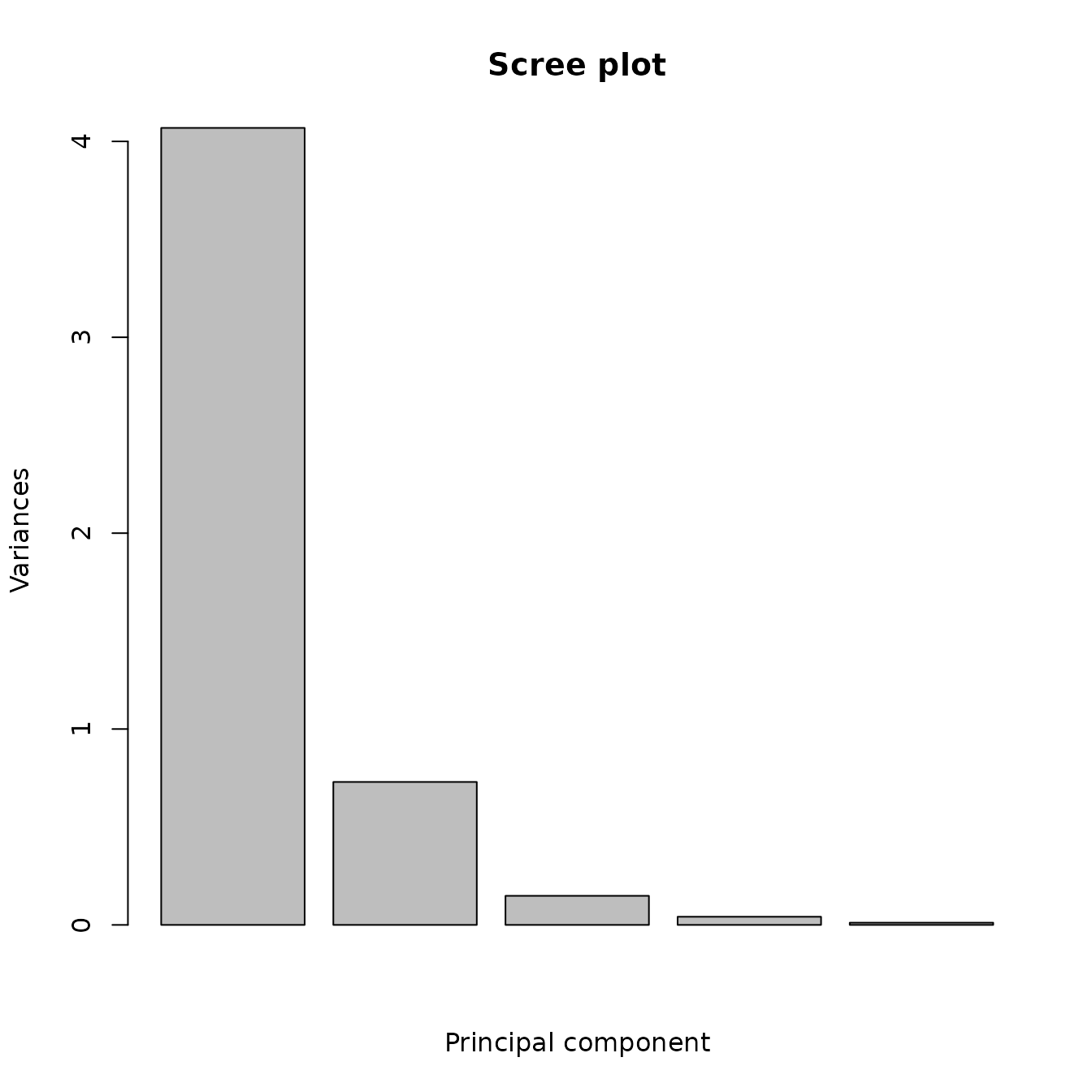
Figure 5.1: The scree plot from the principal components analysis of the Jemez obsidian source data.
data(ObsidianSources)
analyticVars <- c("Rb", "Sr", "Y", "Zr", "Nb")
save_pca <-
  ps_pca(
    data = ObsidianSources,
    ID = "ID",
    GroupVar = "Code",
    Groups = "All",
    AnalyticVars = analyticVars,
    pcPlot = FALSE,
    BoxPlots = TRUE
  )
data(ObsidianSources)
analyticVars <- c("Rb", "Sr", "Y", "Zr", "Nb")
save_pca <-
  ps_pca(
    data = ObsidianSources,
    ID = "ID",
    GroupVar = "Code",
    Groups = "All",
    AnalyticVars = analyticVars
) 
save_pca <-
  ps_pca(
    data = ObsidianSources,
    ID = "ID",
    GroupVar = "Code",
    Groups = "All",
    AnalyticVars = analyticVars,
    pcPlot = FALSE
  )
knitr::kable(save_pca$variances, caption = "Table 5.1:  Proportions of the variance explained in the principal components analysis of the Jemez obsidian source data.") %>%
kable_styling(full_width = F, position = "center")| PC1 | PC2 | PC3 | PC4 | PC5 | |
|---|---|---|---|---|---|
| Standard deviation | 2.017 | 0.854 | 0.385 | 0.204 | 0.106 |
| Proportion of Variance | 0.814 | 0.146 | 0.030 | 0.008 | 0.002 |
| Cumulative Proportion | 0.814 | 0.960 | 0.989 | 0.998 | 1.000 |
knitr::kable(save_pca$weights, caption = "Table 5.2:  Weights for each principal component in the principal components analysis of the Jemez obsidian source data.") %>%
kable_styling(full_width = F, position = "center")| Rb | Sr | Y | Zr | Nb | |
|---|---|---|---|---|---|
| pc_1 | 0.481 | -0.400 | 0.481 | 0.388 | 0.476 |
| pc_2 | 0.222 | -0.643 | -0.243 | -0.690 | 0.045 |
| pc_3 | -0.069 | -0.549 | -0.141 | 0.497 | -0.654 |
| pc_4 | -0.648 | -0.299 | -0.344 | 0.228 | 0.566 |
| pc_5 | -0.543 | -0.190 | 0.756 | -0.273 | -0.153 |
knitr::kable(head(save_pca$DataPlusPredicted), caption = "Table 5.3:  Original data and principal components in the principal components analysis of the Jemez obsidian source data.") %>%
  kable_styling(full_width = F, position = "center") %>%
kable_styling(full_width = F, position = "center")| Code | ID | Rb | Sr | Y | Zr | Nb | PC1 | PC2 | PC3 | PC4 | PC5 | |
|---|---|---|---|---|---|---|---|---|---|---|---|---|
| 1 | A | A1 | 121 | 40 | 23 | 110 | 55 | -0.965 | 0.578 | -0.211 | 0.406 | -0.066 |
| 10 | A | A10 | 113 | 36 | 19 | 107 | 46 | -1.324 | 0.705 | 0.086 | 0.422 | -0.043 |
| 11 | A | A11 | 109 | 42 | 18 | 110 | 51 | -1.338 | 0.544 | -0.078 | 0.583 | -0.121 |
| 12 | A | A12 | 110 | 41 | 20 | 104 | 50 | -1.342 | 0.651 | -0.137 | 0.476 | 0.011 |
| 13 | A | A13 | 116 | 36 | 21 | 107 | 51 | -1.140 | 0.701 | -0.064 | 0.447 | -0.023 |
| 14 | A | A14 | 123 | 38 | 27 | 113 | 56 | -0.757 | 0.512 | -0.201 | 0.353 | 0.067 |
5.2 Evaluating the first two components for a bivariate Gaussian distribution
At each source, each principal component is a linear combination of the elements at that source (for the Jemez obsidian source data, the coefficients are in Table 5.2). If each variable has a Gaussian distribution in a set of variables, a linear combination of these variables has a univariate Gaussian distribution. Therefore, if each element at a source has an approximate Gaussian distribution, the first two principal components at this source may have an approximate Gaussian distribution. However, if at least one element does not have a Gaussian distribution, these principal components are unlikely to have a Gaussian distribution.
The function ps_pcaGaussian() computes p-values, by source, for assessing whether (using the default parameter values) the first two principal components have a bivariate Gaussian distribution. This function uses the function ps_2dPlotGauss(), so the discussion of that function applies here. Table 5.4 contains the p-values from this functions. It is likely that we have approximate bivariate Gaussian distributions at sources A and C, but not at sources B, D, and E.


| group | n | AD_PC1 | AD_PC2 | SW_PC1 | SW_PC2 | maridaSkew | mardiaKurtosis | HZ | Royston |
|---|---|---|---|---|---|---|---|---|---|
| A | 15 | 0.633 | 0.536 | 0.901 | 0.590 | 0.015 | 0.367 | 0.169 | 0.803 |
| B | 16 | 0.418 | 0.048 | 0.639 | 0.109 | 0.003 | 0.026 | 0.001 | 0.152 |
| C | 28 | 0.826 | 0.889 | 0.880 | 0.794 | 0.207 | 0.654 | 0.555 | 0.750 |
| D | 15 | 0.622 | 0.003 | 0.615 | 0.006 | 0.126 | 0.637 | 0.012 | 0.021 |
| E | 39 | 0.138 | 0.285 | 0.309 | 0.364 | 0.000 | 0.000 | 0.012 | 0.373 |

6 CLASSIFICATION TREES (recursive partitioning)
A classification tree is obtained from recursive partitioning when the target (dependent) variable is categorical (a regression tree has a continuous dependent variable). A tree model does a succession of binary splits, so that the result is similar to a botanical key (when there are only two subgroups at each decision point). The method uses a criterion of variation within a group to develop a tree structure for which the terminal groups (nodes) are as uniform as possible, subject to criteria such as a group defined by a split must contain a minimal number of data records in order to be split (the default is 20, which the user can change using the argument minSplit), or that any further splits give improvement in the variation among the terminal groups that is less than a specified minimum (the user can control this using the function argument cP). Note that the requirement of a minimum group size indicates that classification trees should not be used when data sets are too small (an imprecise criterion!).
The classification tree procedure has a number of desirable properties: it is nonparametric (data need not be transformed before being offered to the model, and outliers do not affect the results); the predictor variables can be continuous, categorical, or both; the procedure used yields a prediction error by using cross-validation (defined below); the procedure allows some missing values (see below); if the number of outcome groups and the number of predictor variables are both small enough, the tree can be displayed as a graph, showing the criterion for splitting at each node.
More details about recursive partitioning are in James et al.; Molnar; Strobl, Malley, and Tutz; and in Therneau and Atkinson (this latter reference has examples and explanation of output for the R rpart() function, which we use in our function ps_tree() to create classification trees). It is important to note that, because every node decision is binary, a tree will yield a predicted terminal group for every observation, even if an observation does not resemble any of the other members in that group. The rpart() function uses “surrogate variables” in the algorithm creating the classification tree if an observation contains a missing value; for an explanation of how these variables are chosen, see Therneau and Atkinson.
The function ps_tree() defines splits using a dichotomous criterion for a single variable (in the tree diagram, for the arm going left, the value of that variable is less than a specified amount). The procedure starts by finding the variable in the model statement and the two subgroups defined using that variable that yields two subgroups of the outcome variable (in the case of the obsidian data, subgroups of the sources) that are as “pure” as possible. The default criterion, used in ps_tree(), is the Gini criterion. This splitting procedure is used at each daughter node.
There are a number of implementations of recursive partitioning. We used the rpart() function in the rpart library in R. This function provides an estimate of the potential error (misclassification) in a tree using cross-validation: a subset of the data is deleted, the tree is created using the remaining data; the tree is applied to the subset, to obtain an error rate; this process is repeated, by default 10 times. The rpart() function also has a statistical procedure for choosing the proper number of splits (recursive partitioning trees tend to be too complex, overfitting the data). The software grows a tree with too many nodes (overfits the data), then prunes back the tree so that each split results in a specified minimum improvement (by default, 0.01) in a measure of diversity within a node.
The tree procedure is implemented using a model statement assigned in the parameter Model containing the predictor variables separated by “+” signs. For the examples below, the value of Model is “Sr”+“Nb”+“Rb”+“Y”+“Zr”. The order in which the variables appear in the model statement may affect the tree produced by the algorithm (if several predictor variables yield equally good splits at a node, the procedure may use the variable that appears first in the model statement). Therefore, model statements with variables in different orders can yield different categorical trees. As a result, we suggest running a random forest analysis before a classification tree model, then listing the predictor variables in the tree model statement in the order of importance estimated from the random forest model. The value of Model uses that predicted order.
The function produces two plots, the classification tree and the reduction in the cross-validation error estimate with an increasing number of splits. It returns a list with three results of the computations: a definition of the tree (including the split criteria; this is useful if the tree is too large to be plotted), the classification results, and the Cp table (defined below).
In addition, the function can predict group (source) membership for new observations (artifacts). To do so, set the parameter predictSources equal to TRUE and the parameter predictData equal to the name of a data set with analytic data for the new observations. In this case, the list returned by the function also has components predictedSources, a data frame with the predicted group (source) and analytic data for each new observation (also the sample ID, if there is one), and predictedTotals, a vector with the number of observations assigned to each group (source). Missing values in an observation are also handled using surrogates.
Figure 6.1 shows the classification tree using the obsidian source data (this is the same tree as in Figure 1.1). We will see that the random forest analysis predicts that the importance of these elements for predicting a source is, from greatest to least, strontium, niobium, rubidium, yttrium, and zirconium. There are four splits, rubidium is used twice, two of the potential predictor variables are not used, and each terminal node is pure (contains observations from a single source). Note that rubidium is used instead of niobium in the tree, even though the random forest analysis predicts that niobium is more important. Zirconium, predicted to be the least important predictor, is not used. Rubidium and niobium have a very strong correlation (0.92) if source is ignored, and have high correlations at sources A, C, and D (at least 0.59: Table 4.1); rubidium is used to identify sources A and C.
library(predictSource)
data(ObsidianSources)
analyticVars <- c("Rb", "Sr", "Y", "Zr", "Nb")
tree <-
  ps_tree(
    data = ObsidianSources,
    GroupVar = "Code",
    Groups = "All",
    AnalyticVars = analyticVars,
    Model = "Sr"+"Nb"+"Rb"+"Y"+"Zr",
    ModelTitle = "Sr + Nb + Rb + Y + Zr",
    plotCp = FALSE
  )
Figure 6.1: The classification tree for the Jemez obsidian source data based on five potential elements as predictors.
To understand the structure of the tree and the decision splits, compare this tree with the descriptive statistics for the sources in Table 3.2 and the box plots for the sources in Figure 4.1. Both the table and the figure show that the strontium values in source E are much larger than those values in the other four sources. The minimum value in E is 72; the maximum in the other sources is 54; the value defining the tree branches at this first node is 54, the average of these two values. For the next node, the minimum value at source C is 179; the maximum value at other sources is 178; the cutpoint is the average of these values. Such a small difference implies that we expect misclassification of artifacts using this tree. From Figure 4.1, it would be much better to use niobium or yttrium to assign a sample to source C. Rerunning the analysis with niobium as the first element in the model statement yields the same tree. It is not clear why the algorithm makes this choice, but it is clear that the algorithm does not use the differences between extreme values in candidate groups in creating the tree.
Figure 6.2 shows the reduction in the crossvalidation error estimate with an increasing number of nodes. If there are a large number of splits, the plot may show an horizontal asymptote with an increasing number of splits; this can be useful in deciding to reduce the number of splits. By default, a decrease of 0.01 in Cp is required for a node to be split; the user can change this using the argument cP. It is not clear why the error reduction with three splits is not shown in the plot.
data(ObsidianSources)
analyticVars <- c("Rb", "Sr", "Y", "Zr", "Nb")
tree <-
  ps_tree(
    data = ObsidianSources,
    GroupVar = "Code",
    Groups = "All",
    AnalyticVars = analyticVars,
    Model = "Sr"+"Nb"+"Rb"+"Y"+"Zr",
    ModelTitle = "Sr + Nb + Rb + Y + Zr",
    plotTree = FALSE
  )
Figure 6.2: Plot of the reduction in the crossvalidation error with an increasing number of nodes in the classification tree for the Jemez obsidian source data based on five potential elements as predictors.
If the tree is too complex to display, the description of the tree is contained in the component Tree in the list produced by ps_tree(). For the obsidian sources, this object (an R list) is displayed below. The text above the information [node), split, n, loss, yval, (yprob)] describes what is displayed: the node number, the split criterion, the number of observations at that node, a measure of loss, the predicted group membership at that node, and the proportions in each of the groups at that node. The predicted group membership is the group with the highest proportion. It is helpful to compare this display with the plot showing the tree. Observe that, for a node below the root, the first indented line describes a path to the left in the split, and the value of “node)” is twice the value of “node)” in the node that has been split. The value of “node)” for the path to the right is one greater than the value for the path to the left. This object is displayed below (for much greater detail, we encourage the reader to use the command summary(tree$Tree) after running the example code):
data(ObsidianSources)
analyticVars <- c("Rb", "Sr", "Y", "Zr", "Nb")
tree <-
  ps_tree(
    data = ObsidianSources,
    GroupVar = "Code",
    Groups = "All",
    AnalyticVars = analyticVars,
    Model = "Sr"+"Nb"+"Rb"+"Y"+"Zr",
    ModelTitle = "Sr + Nb + Rb + Y + Zr",
    plotCp = FALSE,
    plotTree = FALSE
  )
tree$Tree
#> NULL
The component classification in the list produced by ps_tree() contains a table with the predicted sources for the data used to create the tree. The results for the Jemez obsidian source data are in Table 6.2. The rows are the known group codes; the columns are the predicted groups. Since there are no prediction errors (see Figure 6.1), the matrix is diagonal. Note that, in Figure 6.1, the terminal nodes from left to right (1 to 5) contain the observations from sources B, A, D, C, and E, in that order, which is different from the row order in Table 6.2.
library(predictSource)
data(ObsidianSources)
analyticVars <- c("Rb", "Sr", "Y", "Zr", "Nb")
tree <-
  ps_tree(
    data = ObsidianSources,
    GroupVar = "Code",
    Groups = "All",
    AnalyticVars = analyticVars,
    Model = "Sr"+"Nb"+"Rb"+"Y"+"Zr",
    ModelTitle = "Sr + Nb + Rb + Y + Zr",
    plotTree = FALSE,
    plotCp = F
  )
knitr::kable(tree$classification, caption = "Table 6.2:  Classification tree predictions for the Jemez obsidian sources using five elements as potential predictors.") %>%
kable_styling(full_width = F, position = "center")| A | B | C | D | E | total | |
|---|---|---|---|---|---|---|
| A | 15 | 0 | 0 | 0 | 0 | 15 |
| B | 0 | 16 | 0 | 0 | 0 | 16 |
| C | 0 | 0 | 28 | 0 | 0 | 28 |
| D | 0 | 0 | 0 | 15 | 0 | 15 |
| E | 0 | 0 | 0 | 0 | 39 | 39 |
| all | 15 | 16 | 28 | 15 | 39 | 113 |
Table 6.3 contains the improvement in predicted group purity, as measured by Cp, and the estimated relative error rates and their standard errors obtained from cross-validation from the tree procedure using the Jemez obsidian source data.
library(predictSource)
data(ObsidianSources)
analyticVars <- c("Rb", "Sr", "Y", "Zr", "Nb")
tree <-
  ps_tree(
    data = ObsidianSources,
    GroupVar = "Code",
    Groups = "All",
    AnalyticVars = analyticVars,
    Model = "Sr"+"Nb"+"Rb"+"Y"+"Zr",
    ModelTitle = "Sr + Nb + Rb + Y + Zr",
    plotTree = FALSE,
    plotCp = F
  )
knitr::kable(tree$CpTable, caption = "Table 6.3:  Cp table from the classification tree for the Jemez obsidian sources using five elements as potential predictors.") %>%
kable_styling(full_width = F, position = "center")| nsplit | nsplit | rel error | xerror | xstd |
|---|---|---|---|---|
| 0 | 0 | 1.000 | 1.000 | 0.068 |
| 1 | 1 | 0.622 | 0.622 | 0.071 |
| 2 | 2 | 0.405 | 0.392 | 0.063 |
| 4 | 4 | 0.000 | 0.041 | 0.023 |
The ps_tree() function will predict sources of unknowns when the parameter predictSources is TRUE and the parameter predictData specifies the data on the unknowns. The member of the list produced by the function named predictedSources (a data frame) contains the predicted source for each observation, the analytic variables, and, if specified, a sample ID. An example using the obsidian artifact data is in Table 6.4. The member of the list named predictedTotals is a vector with the number of unknowns predicted to be from each source; Table 6.5 contains the results using the obsidian data.
data(ObsidianSources)
data(ObsidianArtifacts)
analyticVars <- c("Rb", "Sr", "Y", "Zr", "Nb")
save_tree <-
  ps_tree(
    data = ObsidianSources,
    GroupVar = "Code",
    Groups = "All",
    AnalyticVars = analyticVars,
    Model = "Sr"+"Nb"+"Rb"+"Y"+"Zr",
    ModelTitle = "Sr + Nb + Rb + Y + Zr",
    predictSources = TRUE,
    unknownData = ObsidianArtifacts,
    unknownID = "ID",
    plotTree = FALSE,
    plotCp = FALSE
  )
knitr::kable(save_tree$predictedSource[1:5, ], caption = "Table 6.4: An example of the data frame containing predicted sources of obsidian artifacts from the classification tree for the Jemez obsidian sources using five elements as potential predictors.") %>%
kable_styling(full_width = F, position = "center")| source | predicted | Rb | Sr | Y | Zr | Nb |
|---|---|---|---|---|---|---|
| A | A | 121 | 40 | 23 | 110 | 55 |
| A | A | 117 | 43 | 21 | 110 | 53 |
| A | A | 121 | 44 | 24 | 114 | 49 |
| A | A | 116 | 41 | 22 | 112 | 52 |
| A | A | 118 | 43 | 21 | 111 | 55 |
The locations of the artifact points on a principal components plot with symbols for their predicted sources may be useful in evaluating the reliability of these predictions. Figure 6.3 shows this plot for the predictions from the classification tree analysis using the function ps_pca() (the artifact from source A was removed, as it is far from the other artifacts). The first two principal components explain 91% of the variance. One artifact that is predicted to be from source C appears to be from source D; twelve artifacts predicted to be from source C appear to be from source B. A data frame containing the data generating these points could be obtained by setting the parameter Identify equal to TRUE in the call to ps_pca().
data(ObsidianSources)
data(ObsidianArtifacts)
analyticVars <- c("Rb", "Sr", "Y", "Zr", "Nb")
tree <-
  ps_tree(
    data = ObsidianSources,
    GroupVar = "Code",
    Groups = "All",
    AnalyticVars = analyticVars,
    ID = "ID",
    Model = "Sr"+"Nb"+"Rb"+"Y"+"Zr",
    ModelTitle = "Sr + Nb + Rb + Y + Zr",
    plotTree = FALSE,
    plotCp = F,
    predictSources = TRUE,
    unknownData = ObsidianArtifacts
  )
predictedSource <-
  tree$predictedSource[tree$predictedSource[, "source"] != "A", ]
save_pca <-
  ps_pca(
    data = predictedSource,
    ID = "ID",
    GroupVar = "source",
    Groups = "All",
    AnalyticVars = analyticVars,
    PlotEllipses = FALSE
  )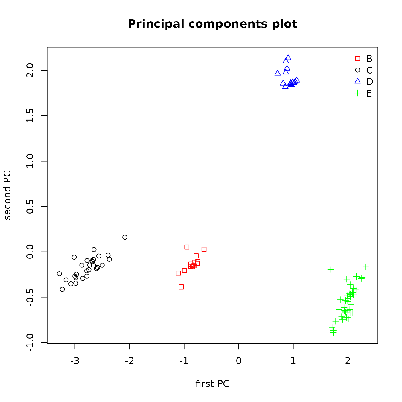
Figure 6.3: Principal components plot of the locations of artifact sources from classification tree model predictions.
7 RANDOM FORESTS
Random forests are a method for obtaining more a more realistic estimate of classification error from a classification tree and for evaluating the relative importance of predictors for those trees. The procedure repeats a classification tree analysis a large number of times (by default in this code, 500 times). For each analysis, the code first selects a bootstrap sample of the observations (a random sample of the same size, chosen with replacement). Because the sample is chosen with replacement, some observations will be in the sample multiple times, and some will not appear. It can be shown that approximately 1/3 of the observations will not appear (these are known as the “out of bag” observations). For each analysis, a classification tree is fit using a random subsample of the predictor variables; the default is to use approximately the square root of the number of predictors (the user can change this with the argument NvarUsed in the function, ps_randomForest()). The resulting tree is used to predict the source of each of the observations not used in the analysis. Then the error rate can be computed from the difference between the predicted and known group memberships.
Random forests can also be used to predict group memberships for observations from unknown sources. Again, a large number of trees are grown using bootstrap data samples and a subsample of the predictors. The group membership is predicted for each unknown. After running all the trees, the membership for an unknown observation is defined to be the most commonly group predicted. These predictions are likely to be better than those from classification a single classification tree. In a sense, the random forest analysis is averaging the predictions from a large number of tree analyses. These analyses are not completely independent, as the data used in the analyses will overlap, as may the predictor variables. However, just as averaging observations reduces the variance of an estimated mean, averaging the tree analyses should produce estimates of group membership that is more accurate than the estimates from a single tree analysis.
The function ps_randomForest() does a random forest analysis on known group membership using the R function randomForest(). The user can change the number of trees grown using the parameter Ntrees and the number of variables used with the parameter NvarUsed; the default value is NA, in which case the code chooses a value close to the square root of the number of predictor variables. An analysis is reproducible if the random number generator used to select the bootstrap samples and the variables used has a specified starting value. It is desirable to specify such a value, which must be a positive integer; the code has a default value of 11111.
Although the R function randomForest() uses classification trees, this function requires that the data to be analyzed (including the data for which group membership is to be predicted) have no missing values. The function ps_randomForest() uses the R function rfImpute() to impute a single value to replace any missing value in the data used to define the algorithm for predicting group membership (for the obsidian data, the sources) and the R function missForest() to replace any missing value in the data for which group membership is to be predicted (for the obsidian data, the artifacts). See Section 9 (Discussion) for more information on these functions.
The ps_randomForest() function produces two plots, the estimated error rate as a function of the number of bootstrap samples, and the importance of each variable based on the mean decrease in the Gini index as a result of the split on that variable. The error rate plot is shown below in Figure 7.1. For the Jemez source data, fewer than 100 samples are required to obtain the estimated out of bag error rate. For a set of sources that are harder to differentiate, the required number of samples is likely to be much higher.
data(ObsidianSources)
analyticVars <- c("Rb", "Sr", "Y", "Zr", "Nb")
saveRandomForest <-
  ps_randomForest(
    data = ObsidianSources,
    GroupVar = "Code",
    Groups = "All",
    AnalyticVars = analyticVars,
    NvarUsed = 3,
    plotImportance = FALSE
  )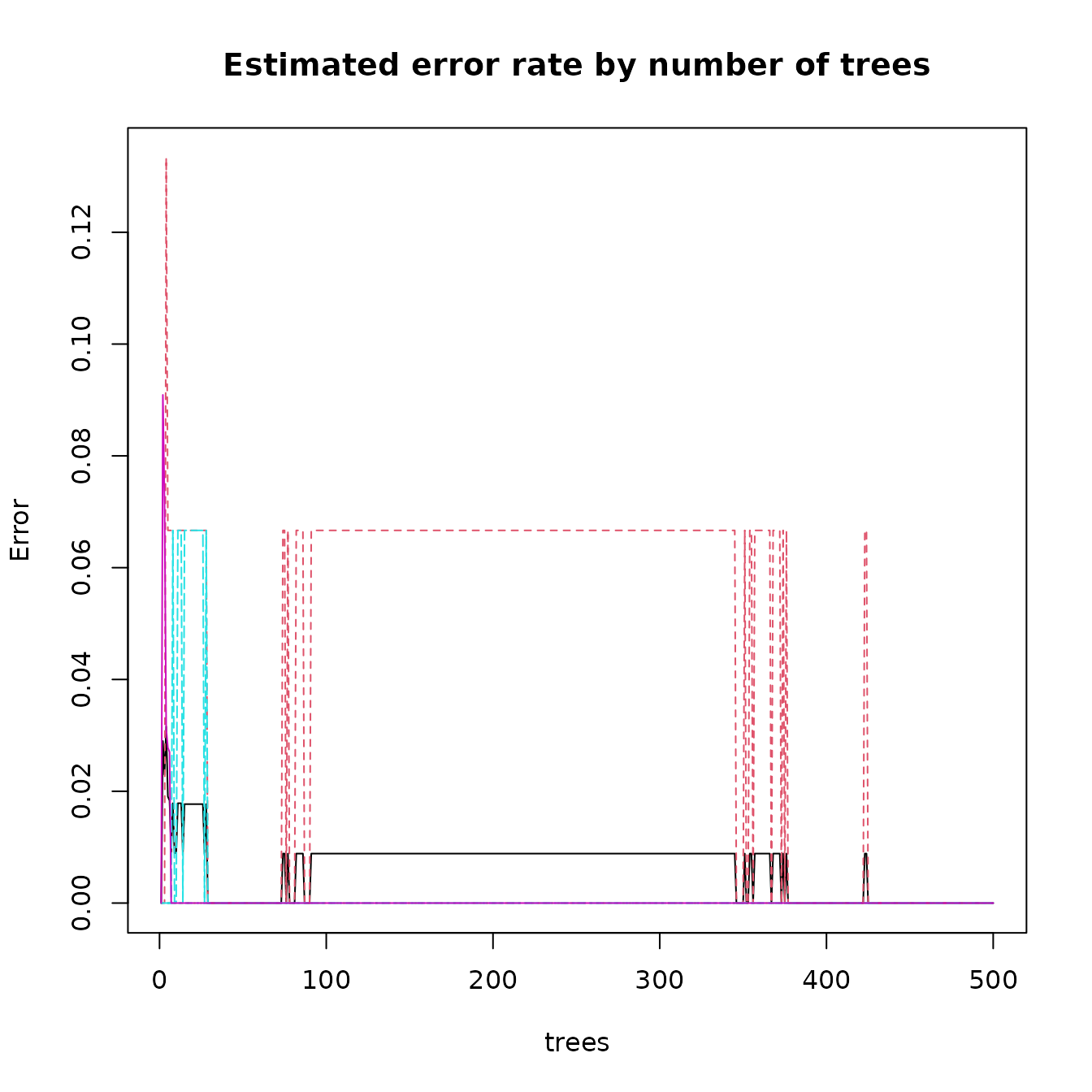
Figure 7.1: Error rates from a random forest analysis of the Jemez obsidian source data.
The variable importance plot is shown in Figure 7.2, and the corresponding table saved in the component named “importance” by the function is in Table 7.1. The corresponding estimates of variable importance using the summary() function on the Tree component of the list produced by ps_tree() are quite different: in the order of the variables in Table 7.1, those are 24, 21, 16, 17, 23. Note that these sum to 101, and so are normalized, whereas those estimates in Table 7.1 sum to 86. Although the magnitudes are not necessarily comparable, the ordering is different: random forests estimates strontium to be most important, while it is third most important in the ps_tree() estimate; rubidium is of modest importance using the random forests estimate, while it is most important based on the ps_tree() estimate.
data(ObsidianSources)
analyticVars <- c("Rb", "Sr", "Y", "Zr", "Nb")
saveRandomForest <-
  ps_randomForest(
    data = ObsidianSources,
    GroupVar = "Code",
    Groups = "All",
    AnalyticVars = analyticVars,
    NvarUsed = 3,
    plotErrorRate = FALSE
  )
Figure 7.2: Variable importance for separating the Jemez obsidian sources using a random forest analysis.
data(ObsidianSources)
analyticVars <- c("Rb", "Sr", "Y", "Zr", "Nb")
saveRandomForest <-
  ps_randomForest(
    data = ObsidianSources,
    GroupVar = "Code",
    Groups = "All",
    AnalyticVars = analyticVars,
    NvarUsed = 3,
    plotImportance = FALSE,
    plotErrorRate = FALSE
  )
knitr::kable(saveRandomForest$importance, caption = "Table 7.1: Relative variable importance in a random forest model for the Jemez obsidian source data.") %>%
kable_styling(full_width = F, position = "center")| MeanDecreaseGini | |
|---|---|
| Rb | 15.5 |
| Sr | 24.4 |
| Y | 14.9 |
| Zr | 11.2 |
| Nb | 19.6 |
The accuracy of classification from the random forest analysis is reported in the component named “confusion” returned by ps_randomForest(). Table 7.2 shows the result for the Jemez obsidian source data. This is the same matrix as the “classification” object from ps_tree().
data(ObsidianSources)
analyticVars <- c("Rb", "Sr", "Y", "Zr", "Nb")
saveRandomForest <-
  ps_randomForest(
    data = ObsidianSources,
    GroupVar = "Code",
    Groups = "All",
    AnalyticVars = analyticVars,
    NvarUsed = 3,
    plotImportance = FALSE,
    plotErrorRate = FALSE
  )
knitr::kable(saveRandomForest$confusion, caption = "Table 7.2: The confusion matrix from a random forest model for the Jemez obsidian source data: accuracy of classification.") %>%
kable_styling(full_width = F, position = "center")| A | B | C | D | E | class.error | |
|---|---|---|---|---|---|---|
| A | 15 | 0 | 0 | 0 | 0 | 0 |
| B | 0 | 16 | 0 | 0 | 0 | 0 |
| C | 0 | 0 | 28 | 0 | 0 | 0 |
| D | 0 | 0 | 0 | 15 | 0 | 0 |
| E | 0 | 0 | 0 | 0 | 39 | 0 |
Setting the parameter predictSources to TRUE and specifying the data frame with information on the unknowns (artifacts) in the parameter predictData yields the predicted sources for the unknowns from a random forest analysis. Detailed information for each unknown is in the member predictedSources of the list returned by the function. A sample of the information in this data frame is in Table 7.3. The predicted source, in the variable “source”, is the source with the greatest origin probability; the data frame also includes the estimated probability of each source as origin. Each probability is calculated as the number of trees predicting the unknown to be from that source, divided by the number of trees grown (by default, 500). The data frame predictedTotals in the list returned by the function has two rows (Table 7.4). The first row tabulates the number of unknowns predicted to be from each source (using the variable “source”); the second row contains the sum of the probabilities for each potential source. Note that the predictions in the first row agree with the estimates from the classification tree model in Table 7.5 for sources A and D but are different for B and C: 23 and 30 for B, from the tree and random forest predictions respectively, and 38 and 31 for C. Recall that the principal component plot in Figure xxx using the predicted sources obtained from the tree model suggested that one artifact predicted to be from B was in fact from C, and eight artifacts predicted to be from C were in fact from B. With these changes, the predictions from the tree model would agree with the predictions from the random forest analysis.
data(ObsidianSources)
data(ObsidianArtifacts)
analyticVars <- c("Rb", "Sr", "Y", "Zr", "Nb")
saveRandomForest <-
  ps_randomForest(
    data = ObsidianSources,
    GroupVar = "Code",
    Groups = "All",
    AnalyticVars = analyticVars,
    NvarUsed = 3,
    plotErrorRate = FALSE,
    plotImportance = FALSE,
    predictSources = TRUE,
    predictData = ObsidianArtifacts,
    plotSourceProbs = FALSE
  )
knitr::kable(
  saveRandomForest$predictedSources[1:5, ],
  caption = "Table 7.3: The predicted source and predicted
  source probabilities from a random forest model for the Jemez obsidian artifact data."
) %>%
kable_styling(full_width = F, position = "center")| source | A | B | C | D | E | Rb | Sr | Y | Zr | Nb | |
|---|---|---|---|---|---|---|---|---|---|---|---|
| 39 | D | 0.000 | 0.002 | 0 | 0.998 | 0.000 | 167 | 12 | 27 | 67 | 48 |
| 143 | D | 0.094 | 0.000 | 0 | 0.764 | 0.142 | 153 | 14 | 25 | 73 | 43 |
| 137 | D | 0.084 | 0.002 | 0 | 0.824 | 0.090 | 165 | 12 | 20 | 68 | 44 |
| 109 | D | 0.000 | 0.000 | 0 | 1.000 | 0.000 | 156 | 12 | 23 | 66 | 48 |
| 190 | D | 0.004 | 0.002 | 0 | 0.994 | 0.000 | 152 | 13 | 23 | 68 | 49 |
knitr::kable(
  saveRandomForest$predictedTotals,
  caption = "Table 7.4: The predicted number of artifacts from
  each Jemez source from a random forest model for the Jemez obsidian artifact data."
) %>%
kable_styling(full_width = F, position = "center")| A | B | C | D | E | |
|---|---|---|---|---|---|
| source | 1.000 | 30.000 | 31.000 | 29.000 | 0.000 |
| sum probabilities | 2.166 | 26.396 | 34.308 | 26.874 | 1.256 |
With the logical parameter plotSourceProbs set equal to T, the user obtains two box plots, in Figures 7.3 and 7.4. The figures provide information on the frequency with which the number of analytic variables used in the random forest analysis (in this case, 3) can predict the source of an unknown correctly.
The first plot uses only the probability for the predicted source for each unknown; the second uses all other probabilities. We ignore the single unknown predicted to be from source A. In the first plot, the median probability is 1 for artifacts from source C and only slightly less than 1 for artifacts from sources B and D. The first quartile of probabilities of unknowns from B is smaller then those from C and D: unknowns from source B are harder to predict than from C and D using three analytic variables.
The second plot shows that there are a few relatively large probabilities for unknowns incorrectly assigned to sources B and C. Table 7.3 displays the data from the data frame predictedSources yielding the probabilities between 0.19 and 0.30 (note that a single point on the plot can represent more than one unknown). The unknown yielding the large probability in Figure 7.3b for source B was predicted to be from source C; the eight unknowns yielding the large probabilities for source C were predicted to be from source B; these artifacts are likely to correspond to the apparent misclassifications by the tree model (this could be verified by creating a data frame containing the data generating those points by setting Identify equal to TRUE when using ps_pca() to generate Figure 8.2c). Figure 8.3 shows a principal components plot (using ps_pca()) of the artifacts predicted to be from sources B, C, and D (the artifact from A was eliminated, as its point is far from the others); the first two principal components also explain 91% of the variance in this plot Comparison with Figure 6.3 for the analysis of the predictions from the tree model show that the artifacts apparently misclassified by that model may be assigned the correct source by the random forest analysis.
data(ObsidianSources)
data(ObsidianArtifacts)
analyticVars <- c("Rb", "Sr", "Y", "Zr", "Nb")
saveRandomForest <-
  ps_randomForest(
    data = ObsidianSources,
    GroupVar = "Code",
    Groups = "All",
    AnalyticVars = analyticVars,
    NvarUsed = 3,
    plotErrorRate = FALSE,
    plotImportance = FALSE,
    predictSources = TRUE,
    predictData = ObsidianArtifacts,
    plotSourceProbs = TRUE
  )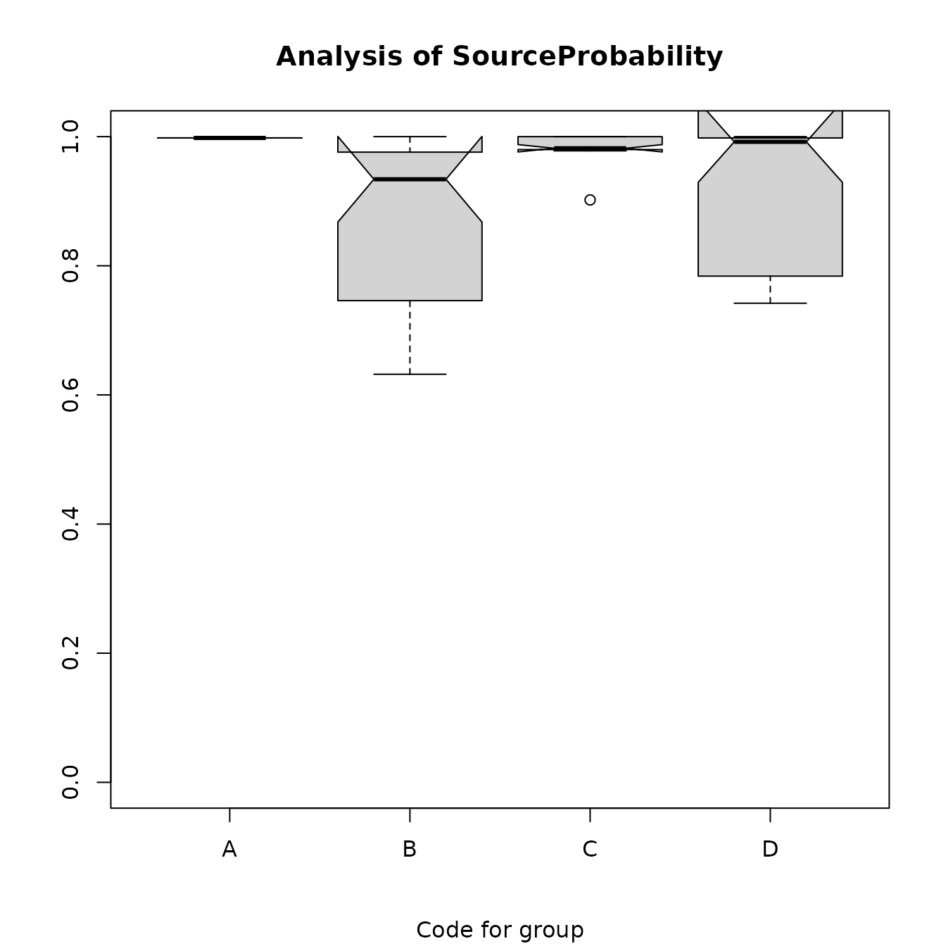
Figure 7.3a: Box plots of the estimated probabilities for the predicted sources for the obsidian artifacts.
data(ObsidianSources)
data(ObsidianArtifacts)
analyticVars <- c("Rb", "Sr", "Y", "Zr", "Nb")
saveRandomForest <-
  ps_randomForest(
    data = ObsidianSources,
    GroupVar = "Code",
    Groups = "All",
    AnalyticVars = analyticVars,
    NvarUsed = 3,
    plotErrorRate = FALSE,
    plotImportance = FALSE,
    predictSources = TRUE,
    predictData = ObsidianArtifacts,
    plotSourceProbs = TRUE
  )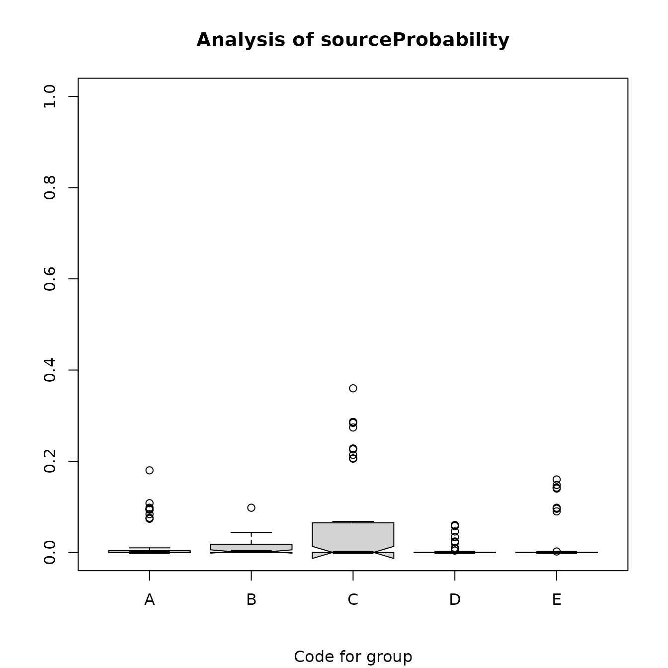
Figure 7.3b: Box plots of the estimated probabilities of sources other than the predicted sources for the obsidian artifacts.
data(ObsidianSources)
data(ObsidianArtifacts)
analyticVars <- c("Rb", "Sr", "Y", "Zr", "Nb")
saveRandomForest <-
  ps_randomForest(
    data = ObsidianSources,
    GroupVar = "Code",
    Groups = "All",
    AnalyticVars = analyticVars,
    sourceID = "ID",
    NvarUsed = 3,
    plotErrorRate = FALSE,
    plotImportance = FALSE,
    predictSources = TRUE,
    predictData = ObsidianArtifacts,
    plotSourceProbs = FALSE
  )
check <- saveRandomForest$predictedSources
rows <- ((check[, "C"] > 0.14) & (check[, "C"] < 0.35))
checkC <- check[rows, ]
orderedRows <- order(checkC[, "C"])
knitr::kable(checkC[orderedRows, ], caption = "Table 7.3:  Rows with relative large probabilities of
             misclassification to source C.") %>%
kable_styling(full_width = F, position = "center")| source | A | B | C | D | E | Rb | Sr | Y | Zr | Nb | |
|---|---|---|---|---|---|---|---|---|---|---|---|
| 16 | B | 0.000 | 0.794 | 0.206 | 0.000 | 0 | 179 | 13 | 47 | 163 | 58 |
| 22 | B | 0.002 | 0.746 | 0.206 | 0.046 | 0 | 181 | 12 | 48 | 174 | 50 |
| 88 | B | 0.000 | 0.794 | 0.206 | 0.000 | 0 | 179 | 15 | 48 | 174 | 61 |
| 87 | B | 0.000 | 0.794 | 0.206 | 0.000 | 0 | 179 | 12 | 46 | 180 | 61 |
| 131 | D | 0.000 | 0.002 | 0.214 | 0.784 | 0 | 182 | 14 | 26 | 70 | 46 |
| 107 | B | 0.000 | 0.774 | 0.226 | 0.000 | 0 | 183 | 11 | 45 | 175 | 60 |
| 51 | B | 0.002 | 0.762 | 0.228 | 0.008 | 0 | 184 | 15 | 43 | 159 | 53 |
| 27 | B | 0.000 | 0.726 | 0.274 | 0.000 | 0 | 186 | 13 | 51 | 182 | 60 |
| 49 | B | 0.002 | 0.656 | 0.284 | 0.058 | 0 | 189 | 16 | 39 | 154 | 47 |
| 24 | B | 0.000 | 0.714 | 0.286 | 0.000 | 0 | 195 | 12 | 47 | 182 | 56 |
| 65 | B | 0.002 | 0.704 | 0.286 | 0.008 | 0 | 195 | 14 | 48 | 171 | 53 |
| 47 | B | 0.002 | 0.654 | 0.286 | 0.058 | 0 | 192 | 15 | 44 | 166 | 48 |
| 388 | B | 0.000 | 0.714 | 0.286 | 0.000 | 0 | 202 | 14 | 41 | 164 | 62 |
data(ObsidianSources)
data(ObsidianArtifacts)
analyticVars <- c("Rb", "Sr", "Y", "Zr", "Nb")
saveRandomForest <-
  ps_randomForest(
    data = ObsidianSources,
    GroupVar = "Code",
    Groups = "All",
    sourceID = "ID",
    AnalyticVars = analyticVars,
    NvarUsed = 3,
    plotErrorRate = FALSE,
    plotImportance = FALSE,
    predictSources = TRUE,
    predictData = ObsidianArtifacts,
    plotSourceProbs = FALSE
  )
predictedSources <-
  saveRandomForest$predictedSources[saveRandomForest$predictedSources[, "source"] !=
                                      "A", ]
save_pca <-
  ps_pca(
    data = predictedSources,
    ID = "source",
    GroupVar = "source",
    Groups = "All",
    AnalyticVars = analyticVars,
    PlotEllipses = FALSE
  )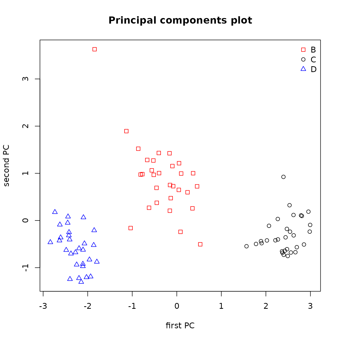
Figure 7.4: Principal components plot of the predicted sources of the obsidian artifacts from a random forests analysis.
8 EVALUATION OF THE PREDICTIONS
We suggest two analyses for evaluating whether predicted sources for artifacts are correct: box plots similar to Figure 4.2 (Figure 8.1), and principal components plots. It is clear from the plots for yttrium and niobium in Figure 8.1 that the tree analysis improperly assigned some artifacts to source C (one of which seems likely to be from source D), and perhaps one artifact is improperly assigned to source B. The function generating principal components plots will allow us to identify the data generating these suspect assignments.
data(ObsidianSources)
data(ObsidianArtifacts)
analyticVars <- c("Rb", "Sr", "Y", "Zr", "Nb")
sources <- unique(ObsidianSources[, "Code"])
saveTree <-
  ps_tree(
    data = ObsidianSources,
    GroupVar = "Code",
    Groups = "All",
    AnalyticVars = analyticVars,
    Model = "Sr"+"Nb"+"Rb"+"Y"+"Zr",
    ModelTitle = "Sr + Nb + Rb + Y + Zr",
    predictSources = TRUE,
    predictUnknowns = TRUE,
    unknownData = ObsidianArtifacts,
    unknownID = "ID",
    plotTree = FALSE,
    plotCp = FALSE
  )
ObsidianSources <- ObsidianSources[, c("Code", analyticVars)]
Artifacts <-
  saveTree$predictedSourceUnknowns[, c("predicted", analyticVars)]
SourcesCode <- as.vector(ObsidianSources[, "Code"], mode = "character")
ArtifactsCode <-
  as.vector(paste(Artifacts[, "predicted"], "a", sep = "."), mode = "character")
Sources <- c(SourcesCode, ArtifactsCode)
SourcesArtifacts <-
  data.frame(rbind(ObsidianSources[, analyticVars], Artifacts[, analyticVars]))
SourcesArtifacts <- data.frame(SourcesArtifacts, Source = Sources)
boxPlots <-
  ps_boxPlots(
    data = SourcesArtifacts,
    GroupVar = "Source",
    Groups = "All",
    AnalyticVars = c("Y", "Nb"),
    Nrow = 2,
    Ncol = 1
  )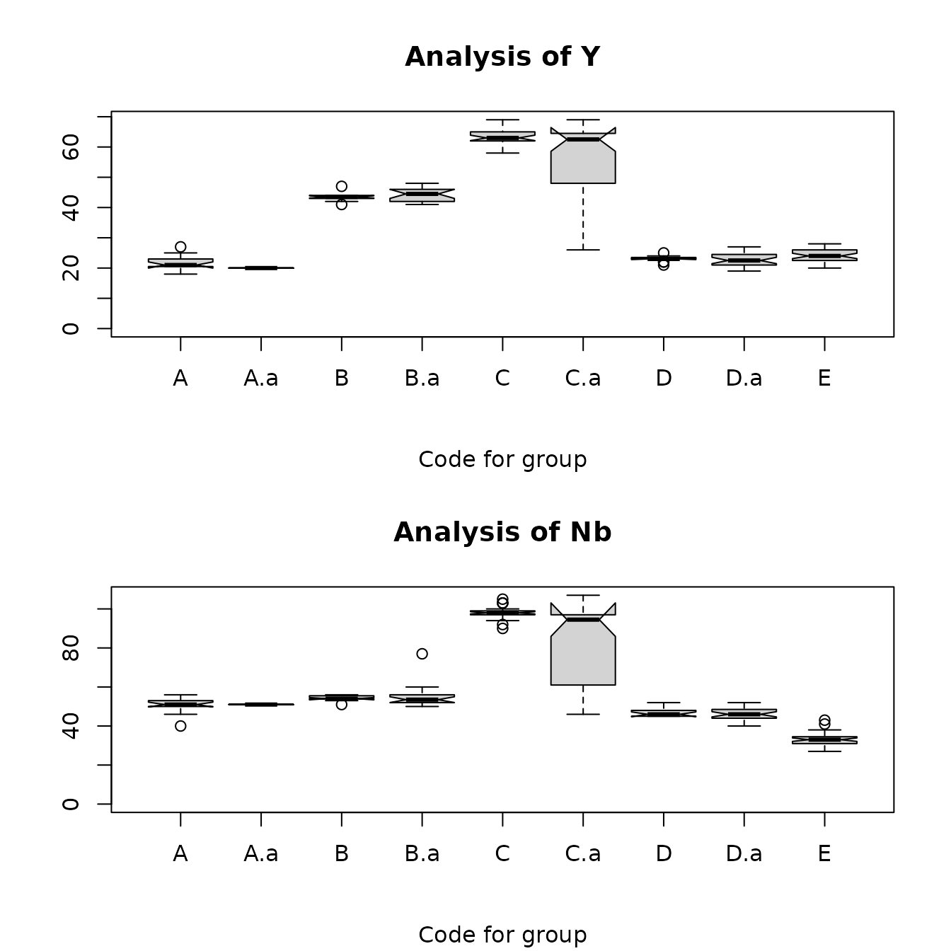
Figure 8.1: Box plots for yttrium and niobium comparing the Jemez obsidian sources and the obsidian artifacts assigned to those sources by a classification tree analysis. The plot for x.a is the artifacts assigned to source x.
We have already seen that the utility principal component plots of the predictions from the tree and random forest analysis in evaluating predictions. The tree analysis gives predictions that appear to be wrong, while all predictions from the random forest analysis appear to be correct. The function ps_pcaEvaluation() creates plots that are more informative than those in Figures 6.3 and 7.4 by adding symbols for the artifact points generated by the predictions (contained in the data frame specified in the parameter ArtifactData) to a principal components plot with the convex hulls of the source data (specified in the parameter SourceData). The data frame ArtifactData must contain a variable with the predicted source for each point. The points generated by the unknowns predicted to come from a source should fall within or close to the convex hull of that source if the predictions are correct. The user specifies the known sources and predicted sources of interest with the parameters known_sources and predicted_sources, respectively. Defining the parameter Identify to be TRUE allows the user to create a data frame containing data generating points that may represent misclassified unknowns.
Because a principal components analysis cannot use an observation with missing data, the function ps_pcaEvaluation() imputes values to replace any missing values. For the data from known groups (the source data), it uses the R function rfImpute; for the data from unknowns with predictions to be verified (artifacts), it uses the R function missForest. See Section 9 (Discussion) for more information on these imputation functions.
The evaluation function can produce three plots, shown in Figures 8.2a, 8.2b, and 8.2c, below (parameters in the call to the function allow the user to specify which plots to produce). The plots in these figures use the predictions from the classification tree obtained from ps_tree() with the model “Sr”+“Nb”+“Rb”+“Y”+“Zr”. Each plot is the plot of the first two principal components, obtained from a principal component analysis of all sources and all unknowns used in the analysis. The first plot has two panels: the left panel plots the source points and the convex hulls for the sources; the right panel plots all unknowns with the convex hulls for the sources. The second plot also has two panels: the left panel plots the source convex hulls labeled with the code for the source located at the median of all the source points; the right panel plots the source hulls and all unknown points that lie outside the predicted source hull. The third plot is the right panel of the second plot; this plot is useful for identifying points of interest generated by unknowns. This plot will be produced if Identify = T. The data frame checkData in the list returned by the function contains the data generating points identified to be of interest, as well as the first two principal component values for these points.
data(ObsidianSources)
data(ObsidianArtifacts)
analyticVars <- c("Rb", "Sr", "Y", "Zr", "Nb")
sources <- unique(ObsidianSources[, "Code"])
saveTree <-
  ps_tree(
    data = ObsidianSources,
    GroupVar = "Code",
    Groups = "All",
    AnalyticVars = analyticVars,
    Model = "Sr"+"Nb"+"Rb"+"Y"+"Zr",
    ModelTitle = "Sr + Nb + Rb + Y + Zr",
    predictSources = TRUE,
    unknownData = ObsidianArtifacts,
    ID = "ID",
    plotTree = FALSE,
    plotCp = FALSE
  )
pcaEval <-
  ps_pcaEvaluation(
    SourceData = ObsidianSources,
    unknownData = saveTree$predictedSource,
    SourceGroup = "Code",
    unknownGroup = "predicted",
    known_sources = sources,
    predicted_sources = sources,
    AnalyticVars = analyticVars,
    plotAllPoints = TRUE,
    plotHullsOutsidePoints = TRUE,
    plotOutsidePoints = FALSE
  )
Figure 8.2a: Principal components plots of the Jemez obsidian source convex hulls with the source points (left panel) and obsidian artifact points (right panel). The artifacts are labeled with their predicted source from a classification tree analysis.
data(ObsidianSources)
data(ObsidianArtifacts)
analyticVars <- c("Rb", "Sr", "Y", "Zr", "Nb")
sources <- unique(ObsidianSources[, "Code"])
saveTree <-
  ps_tree(
    data = ObsidianSources,
    GroupVar = "Code",
    Groups = "All",
    AnalyticVars = analyticVars,
    Model = "Sr"+"Nb"+"Rb"+"Y"+"Zr",
    ModelTitle = "Sr + Nb + Rb + Y + Zr",
    predictSources = TRUE,
    unknownData = ObsidianArtifacts,
    ID = "ID",
    plotTree = FALSE,
    plotCp = FALSE
  )
pcaEval <-
  ps_pcaEvaluation(
    SourceData = ObsidianSources,
    unknownData = saveTree$predictedSource,
    SourceGroup = "Code",
    unknownGroup = "predicted",
    known_sources = sources,
    predicted_sources = sources,
    AnalyticVars = analyticVars,
    plotAllPoints = TRUE,
    plotHullsOutsidePoints = TRUE,
    plotOutsidePoints = FALSE
  )
Figure 8.2b: Principal components plots of the Jemez obsidian source convex hulls with the source point medians (left panel) and obsidian artifact points outside the predicted source hulls (right panel). The artifacts are labeled with their predicted source from a classification tree analysis.
data(ObsidianSources)
data(ObsidianArtifacts)
analyticVars <- c("Rb", "Sr", "Y", "Zr", "Nb")
sources <- unique(ObsidianSources[, "Code"])
saveTree <-
  ps_tree(
    data = ObsidianSources,
    GroupVar = "Code",
    Groups = "All",
    AnalyticVars = analyticVars,
    Model = "Sr"+"Nb"+"Rb"+"Y"+"Zr",
    ModelTitle = "Sr + Nb + Rb + Y + Zr",
    predictSources = TRUE,
    unknownData = ObsidianArtifacts,
    ID = "ID",
    plotTree = FALSE,
    plotCp = FALSE
  )
pcaEval <-
  ps_pcaEvaluation(
    SourceData = ObsidianSources,
    unknownData = saveTree$predictedSource,
    SourceGroup = "Code",
    unknownGroup = "predicted",
    known_sources = sources,
    predicted_sources = sources,
    AnalyticVars = analyticVars,
    ID = "ID",
    plotAllPoints = TRUE,
    plotHullsOutsidePoints = TRUE,
    plotOutsidePoints = TRUE
  )
Figure 8.2c: Principal components plot with Jemez obsidian source convex hulls and obsidian artifacts with points outside the convex hull predicted from a classification tree model.
Eleven artifacts predicted to be from source C are close to or closer to the hull from source B in Figure 8.1c, as well as one such point near the right corner of the hull for source D. Table 8.1 contains the data generating eleven such points. Since two pairs of these points are very close to each other, it is difficult to identify all of them.
data(tree.data.check)
knitr::kable(tree.data.check, caption = "Table 8.1: Artifacts which may have misidentified sources identified by using Identify=TRUE in ps_pcaEvaluation() after fitting a tree model.  The variable group is the predicted source from the model.") %>%
kable_styling(full_width = F, position = "center")| group | ID | Rb | Sr | Y | Zr | Nb | pc1 | pc2 | |
|---|---|---|---|---|---|---|---|---|---|
| 131 | C | A22 | 182 | 14 | 26 | 70 | 46 | -0.88 | 1.67 |
| 161 | C | A61 | 179 | 13 | 47 | 163 | 58 | 0.78 | -0.06 |
| 241 | C | A62 | 195 | 12 | 47 | 182 | 56 | 1.12 | -0.24 |
| 651 | C | A63 | 195 | 14 | 48 | 171 | 53 | 0.96 | -0.12 |
| 221 | C | A65 | 181 | 12 | 48 | 174 | 50 | 0.79 | -0.21 |
| 271 | C | A69 | 186 | 13 | 51 | 182 | 60 | 1.19 | -0.37 |
| 1071 | C | A78 | 183 | 11 | 45 | 175 | 60 | 0.95 | -0.15 |
| 871 | C | A81 | 179 | 12 | 46 | 180 | 61 | 0.98 | -0.29 |
| 511 | C | A86 | 184 | 15 | 43 | 159 | 53 | 0.57 | 0.04 |
| 491 | C | A88 | 189 | 16 | 39 | 154 | 47 | 0.34 | 0.19 |
| 388 | C | A89 | 202 | 14 | 41 | 164 | 62 | 0.96 | 0.12 |
In contrast, in the corresponding plot based on the random forest analysis, these artifacts are predicted to come from the sources generating the convex hulls to which they are closest: see Figure 8.3.
data(ObsidianSources)
data(ObsidianArtifacts)
analyticVars <- c("Rb", "Sr", "Y", "Zr", "Nb")
sources <- unique(ObsidianSources[, "Code"])
saveRandomForest <-
  ps_randomForest(
    data = ObsidianSources,
    GroupVar = "Code",
    Groups = "All",
    AnalyticVars = analyticVars,
    sourceID = "ID",
    NvarUsed = 3,
    plotErrorRate = FALSE,
    plotImportance = FALSE,
    predictSources = TRUE,
    predictData = ObsidianArtifacts,
    plotSourceProbs = FALSE
  )
pcaEval <- ps_pcaEvaluation(
  SourceData = ObsidianSources,
  unknownData = saveRandomForest$predictedSources,
  SourceGroup = "Code",
  unknownGroup = "source",
  known_sources = sources,
  predicted_sources = sources,
  AnalyticVars = analyticVars,
  plotAllPoints = TRUE,
  plotHullsOutsidePoints = TRUE,
  plotOutsidePoints = TRUE
)
Figure 8.3: Principal components plot of the Jemez obsidian source convex hulls and sources outside of those hulls using predictions from a random forests analysis.
Finally, to demonstrate the utility of using a principal component plot to verify source predictions made using 2- and 3-dimensional scatterplots, Figure 8.4 performs this evaluation using Steve Shackley’s artifact source predictions. We see one artifact predicted to be from source D that falls inside the convex hull for source C. Using Identify=TRUE in the call to ps_pcaEvaluation(), we find that this is artifact A17; its values of rubidium (225), yttrium (65), and niobium (96) all clearly agree with the corresponding values from source C rather than source D in Table 3.2.
data(ObsidianSources)
data(ObsidianArtifacts)
analyticVars <- c("Rb", "Sr", "Y", "Zr", "Nb")
sources <- unique(ObsidianSources[, "Code"])
pcaEval <-
  ps_pcaEvaluation(
    SourceData = ObsidianSources,
    unknownData = ObsidianArtifacts,
    SourceGroup = "Code",
    unknownGroup = "Code",
    known_sources = sources,
    predicted_sources = sources,
    AnalyticVars = analyticVars,
    ID = "ID",
    plotAllPoints = TRUE,
    plotHullsOutsidePoints = TRUE,
    plotOutsidePoints = TRUE
  )
Figure 8.4: Principal components plot with Jemez obsidian source convex hulls and obsidian artifacts with points outside the convex hull labeled with Steve Shackley’s source predictions.
Table 8.2 contains the source assignment probability estimates from the random forests analysis for the artifacts tabulated in Table 8.1, all of which were assigned to source C by the classification tree analysis. As we can see from the value of pc2, artifact A22 is close to the hull for source D; the remaining artifacts are close to the hull for source B. All of these artifacts have probabilities of arising from source C of 0.21 to 0.29; their probabilities of arising from the “correct”” source are 0.71 to 0.79. We can use the descriptive statistics in Table 3.2 to verify that the random forest assignments for these artifacts are correct. Based on the niobium values, these artifacts clearly are not from source C. The yttrium value for A22 agrees with those from source D, and the values for the remaining artifacts match the yttrium values from source B. Thus, the random forest source assignments appear to be correct, and a relatively large probability of assignment to a source other than the source with the greatest probability identifies an artifact that may warrant a more careful evaluation of source assignment.
data(ObsidianSources)
data(ObsidianArtifacts)
data(tree.data.check)
analyticVars <- c("Rb", "Sr", "Y", "Zr", "Nb")
sources <- unique(ObsidianSources[, "Code"])
saveRandomForest <-
  ps_randomForest(
    data = ObsidianSources,
    GroupVar = "Code",
    Groups = "All",
    AnalyticVars = analyticVars,
    sourceID = "ID",
    NvarUsed = 3,
    plotErrorRate = FALSE,
    plotImportance = FALSE,
    predictSources = TRUE,
    predictData = ObsidianArtifacts,
    unknownID = "ID",
    plotSourceProbs = FALSE
  )
treeDataCheck <- tree.data.check[order(tree.data.check[, "ID"]), ]
saveRF <-
  saveRandomForest$predictedSources[order(saveRandomForest$predictedSources[, "source"]), ]
obsCheck <- merge(
  x = saveRF,
  y = tree.data.check[, c("ID", "pc1", "pc2")],
  by = "ID",
  x.all = FALSE,
  y.all = FALSE
)
knitr::kable(obsCheck, caption = "Table 8.2: Random forest probability estimates for artifacts which may have  been misidentified as from source C using the tree model identified by using Identify=TRUE in ps_pcaEvaluation().  source is the predicted source from the random forest procedure.") %>%
kable_styling(full_width = F, position = "center")| ID | source | A | B | C | D | E | Rb | Sr | Y | Zr | Nb | pc1 | pc2 |
|---|---|---|---|---|---|---|---|---|---|---|---|---|---|
| A22 | D | 0.000 | 0.002 | 0.214 | 0.784 | 0 | 182 | 14 | 26 | 70 | 46 | -0.88 | 1.67 |
| A61 | B | 0.000 | 0.794 | 0.206 | 0.000 | 0 | 179 | 13 | 47 | 163 | 58 | 0.78 | -0.06 |
| A62 | B | 0.000 | 0.714 | 0.286 | 0.000 | 0 | 195 | 12 | 47 | 182 | 56 | 1.12 | -0.24 |
| A63 | B | 0.002 | 0.704 | 0.286 | 0.008 | 0 | 195 | 14 | 48 | 171 | 53 | 0.96 | -0.12 |
| A65 | B | 0.002 | 0.746 | 0.206 | 0.046 | 0 | 181 | 12 | 48 | 174 | 50 | 0.79 | -0.21 |
| A69 | B | 0.000 | 0.726 | 0.274 | 0.000 | 0 | 186 | 13 | 51 | 182 | 60 | 1.19 | -0.37 |
| A78 | B | 0.000 | 0.774 | 0.226 | 0.000 | 0 | 183 | 11 | 45 | 175 | 60 | 0.95 | -0.15 |
| A81 | B | 0.000 | 0.794 | 0.206 | 0.000 | 0 | 179 | 12 | 46 | 180 | 61 | 0.98 | -0.29 |
| A86 | B | 0.002 | 0.762 | 0.228 | 0.008 | 0 | 184 | 15 | 43 | 159 | 53 | 0.57 | 0.04 |
| A88 | B | 0.002 | 0.656 | 0.284 | 0.058 | 0 | 189 | 16 | 39 | 154 | 47 | 0.34 | 0.19 |
| A89 | B | 0.000 | 0.714 | 0.286 | 0.000 | 0 | 202 | 14 | 41 | 164 | 62 | 0.96 | 0.12 |
9 Discussion
These data demonstrate the advantage of using a random forest analysis rather than a classification tree to predict artifact sources. While the classification tree in Figure 6.1 separates the sources without error, we have seen that the choice of rubidium for splitting the second node is not optimal (niobium would be much better). The random forest analysis avoids this error by choosing random sets of predictor variables, including sets without rubidium.
Our proposed analysis procedure has limitations. The number of samples per source must be large enough for using a random forest analysis, but there seem to be no recognized guidelines for required sample sizes. It seems likely that the sample sizes required would increase as the separation between sources decreases. Our results suggest that, if the distribution of the predictors is roughly multivariate Gaussian, 20 samples per source is sufficient with well-separated sources. Biau and Scornet state that “The approach [random forests], which combines several randomized decision trees and aggregates their predictions by averaging, has shown excellent performance in settings where the number of variables is much larger than the number of observations.” They provide references to analyses in which random forests were effective. Several approaches will provide information on the utility of random forests for a particular data set. One which is obtained directly from the analysis is the out-of-bag error estimate using the source data. A second possibility is to split the source data into training and evaluation samples, perhaps multiple times, and evaluate how well an analysis of a training sample predicts source membership for the evaluation sample; this approach requires enough samples from unknowns to make useful splits.
If there are more than two predictor variables, using the first two principal components to evaluate the validity of source predictions requires that there be strong enough correlations between the predictors so that the first two principal components capture most of the variance, and that the predictors be quantitative, not qualitative. If some predictors are qualitative, the principal components analysis could be done using only the quantitative predictors. This could identify some sources or artifacts that are misclassified. The first two principal components are less likely to be adequate if there are a large number of predictors.
The principal components evaluation plot may be useful in verifying the validity of assignments of artifacts to sources. This evaluation identified two artifacts for which Shakely’s assignment was wrong; one of these is the artifact with ID A17 identified in Section 8.
The analysis of the likely sources of all approximately 450 Pojoaque obsidian artifacts provides useful experience in using these procedures. That analysis considered 24 possible obsidian sources (21 distinct locations from Shakely’s data, two of which were subdivided into two or three sources) which provided 706 samples, with samples sizes of 15 to 64 per source. The classification tree analysis separated these sources quite well, with an estimated error rate of about 5%. That analysis predicted that the artifacts came from eight sources: four Jemez sources, one source in west central New Mexico (Mount Taylor, southwest of the Jemez caldera), and three other sources farther west (two near the New Mexico / Arizona border, and one in Arizona). Shackley assigned approximately 150 artifacts to one of the Jemez sources; these assignments are known to be correct as result of the appearance of the obsidian from that site. However, the classification tree analysis predicted that approximately 90% of these artifacts were from one of the sources (call it source F) on the New Mexico / Arizona border.
A second analysis restricting the candidate sources to the eight identified in the first analysis permits using the principal components (PC) plot to evaluate the predictions. The plot was further improved by eliminating the Mount Taylor source and the artifacts assigned to that source, since the Mount Taylor data are far removed from the other sources on the PC plot. The PC plot shows that the great majority of the points generated by the approximately 150 artifacts known to be from the Jemez source lie between the convex hulls of the Jemez source and source F. On an initial PC plot of all 24 sources, plotting only the medians as in the left panel of Figure 8.2a, the source data from the Jemez source and source F are quite close. This fact, and the fact that the artifacts and sources were analyzed using different instruments, explain the misclassification of these artifacts by the classification tree analysis. This experience emphasized the importance of considering archaeological knowledge in predicting sources of artifacts..
Also, we observed that these analyses may be useful after an analysis, such as a cluster analysis, used to identify groups of similar artifacts when potential sources are not known. After artifacts are grouped, those groupings can be used in several ways: a principal components plot suggests how well the groups are separated (if the first two components explain sufficient variance); a random forests analysis estimates the error in using the data to form groups and evaluates the order in which variables should be used to separate the groups; a classification tree analysis using this ordering shows how the variables should be used to group the artifacts.
10 Code use
To the extent possible, the functions in this package use a standard set of parameter names and return a list whose elements have a standard set of names. This section describes these conventions and provides other information for using functions in the package.
Function parameters:
The function ps_createData() does not use all of these parameters. The following summary applies to the remaining functions.
doc: A character variable containing documentation of usage, the contents of which are returned in the list element usage. The default value is the function name; the user can add other information.
data: A data frame containing the data to be analyzed. The data frame must contain a variable defining the grouping and the variables (which may be both quantitative and qualitative) used to predict group membership. It is highly desirable to include an ID variable (typically, a lab ID).
GroupVar: A character variable defining the variable containing grouping information.
Groups: A character variable defining the groups to be used. If “All”, all groups are used; if c(“A”,”B”,”C”), only groups A, B, and C are used. If “ “, there is no grouping.
AnalyticVars: A vector with the character names of the variables to be used to predict group membership.
Additional parameters used in many functions are:
ID: A character variable with the name of the variable containing the sample ID.
Identify: A logical variable (default is F) in functions that create two-dimensional scatter plots. If T, the use can identify the data creating points of interest; these data are saved in the data frame dataCheck, which is returned by the function. Information on using this option is below.
folder: A character variable with the path to a folder in which results will be stored, typically as one or more excel files. The default value is “ “, used when no results will be written externally.
The functions ps_tree() and ps_randomForest() use:
predictData: A data frame with the data used to predict the sources of unknowns (artifacts), including group and analytic variables; most users will also want to include the sample ID. The default values is NA, in which case no predictions are made.
Seed: An integer used to set the random number generator that the function uses, so that results are reproducible. The function specifies a default value; changing it will produce a different analysis. If the value is NA, the random number generator produces an initial value and the analysis cannot be replicated.
Values returned by the function
Each function returns a list documenting its use. Unless the function only creates plots, the list contains data frames with analysis results. All functions return the following:
usage: A character-valued object containing the contents of the parameter doc, the date the code was run, and the version of R used to run the function.
dataUsed: A data frame containing the data from the parameter data used in the analysis. If not all groups were used, dataUsed is restricted to the groups actually used.
analyticVars: A character-valued vector with the value of the parameter AnalyticVars.
paramsXX: One or more vectors or lists containing the values of the arguments of parameters used to define the analysis to be done. E.g., paramsGrouping may be a vector with the values of the parameters GroupVar and Groups.
location: Unless the function only creates one or more plots, the value of the parameter folder.
dataCheck: Returned by functions creating two-dimensional scatter plots. If Identify is F, the value is NA. If Identify is true and the user identifies points of interest, dataCheck is a data frame containing the data generating these points.
Using the functions
To execute the example code in the function documentation, the user should highlight that section of the code in the documentation in the window showing the function and, in the windows operating system, use Control+Enter; in the macOS, use Cmd+Enter.
Functions that create more than one plot contain one or more comment lines with the command browser() after each plot to stop function execution. If the user is running code using base R, this command allows the user to examine and potentially save the plot to a file. The function must be edited to remove the comment symbol (#). In Rstudio, this command is not be necessary, as the user can examine a set of plots in the Plot window using the back arrow. To continue execution after browser() is executed, the user should enter c at the prompt. Most functions can produce more than one plot. Those that do are ps_2dPlot(), ps_2dPlotGauss(), ps_3dPlot(), ps_3dPlotRotate(), ps_boxPlots(), ps_CV_corr(), ps_pairsPlot(), ps_pca(), ps_pcaEvaluation(), ps_pcaGaussian(), and ps_randomForest().
If Identify is TRUE, the user must interact with a plot before continuing. To identify a point of interest, place the cursor as close to the point as possible and left click. The data creating the point closest to the cursor will be added to the data frame dataCheck. Repeat for all points of interest. After all points are identified (or if no point is identified), the user must end the interaction: in the Windows operating system, right click; in Rstudio, click on Finish in the upper right corner of the plot window.
Code for the functions ps_pca(), ps_pcaEvaluation(), and ps_randomForest() use the R functions rfImpute() and missForest() to impute single values for missing values of analytic variables. The code uses the function rfImpute() when the group for an observation is known (for obsidian data, the source). The algorithm first replaces a missing value by the median of the non-missing values for the same variable, runs the random forest analysis on the completed data, and finally replaces a missing value by a weighted average of the values that were not missing for the same variable; weights are proportional to the frequency with which observations are in the same terminal node. The code uses the function missForest() when the group for an observation is not known (for obsidian data, the artifacts). This is an iterative procedure which uses a random forest analysis to use the non-missing data to predict each missing value; the iteration continues until a stopping criterion is met based on comparing the previous and current complete data sets. The function computes an out-of-bag (OOB) error estimate which is not returned in the current implementation. For examples, see the vignette for this function by Steckhoven.
Note that each of these procedures imputes single missing values. Using a single missing value in an analysis underestimates the uncertainty in the results. For example, current statistical practice to do a regression analysis with missing values requires doing the analysis multiple times (typically, 5 to 10 is adequate) with a set of imputed values representing the uncertainties in the imputations, then combining the regression results in an appropriate way (variance estimates include the variability in the individual analysis results). Therefore, analyses with imputed values should be treated cautiously, especially if there are a substantial proportion of missing values.
11 References
G Biau and E Scornet. A random forest guided tour. http://www.normalesup.org/~scornet/paper/test.pdf
JM Chambers, WS Cleveland, B Kleiner, and PA Tukey. Graphical Methods for Data Analysis. Duxbury Press, Boston, 1983.
RB D’Agostino and MA Stephens, eds. Goodness-of-Fit Techniques, Marcel Dekker, New York, 1986.
PJ Farrell, M Salibian-Barrera, and K Naczk. On tests for multivariate normality and associated simulation studies. J Statistical Computation and Simulation 77, 1065-1080, 2007. https://doi.org/10.1080/10629360600878449
G James, D Witten, T Hastie, and R Tibshirani. An Introduction to Statistical Learning with Applications in R. Springer, New York, 2014.
RA Johnson and DW Wichern. Applied Multivariate Statistical Analysis. Prentice-Hall, Englewood Cliffs, NJ, 1982.
C Molnar. Interpretable Machine Learning. https://christophm.github.io/interpretable-ml-book/
DJ Steckhoven. Using the missForest package. https://stat.ethz.ch/education/semesters/ss2012/ams/paper/missForest_1.2.pdf
C Strobl, J Malley, and G Tutz. An introduction to recursive partitioning: rationale, application, and characteristics of classification and regression trees, bagging, and random forests. Psychological Mathods 14, 323-348, 2009. doi: 10.1037/a0016973. http://www.ncbi.nlm.nih.gov/pubmed/19968396
TM Therneau and E. Atkinson. An Introduction to Recursive Partitioning Using the RPART Routines. https://cran.r-project.org/web/packages/rpart/vignettes/longintro.pdf
RW Oldford. Self-Calibrating Quantile–Quantile Plots. The American Statistician, vol. 70, 2016, 74-90